Trang

Hiển thị các bài đăng có nhãn webdesign. Hiển thị tất cả bài đăng

2 thg 5, 2013

10 cách để phân tách vùng nội dung trong thiết kế web


Một vấn đề đơn giản bạn thường gặp trong thiết kế web là tách nội dung thành hai phần riêng biệt khác nhau. Là một nhà thiết kế, tôi thường dùng một đến hai thủ thuật để làm việc này. Vậy tại sao lại không kết hợp các thủ thuật với nhau?
Hôm nay, chúng tôi sẽ cho bạn thấy 10 cách tuyệt vời giúp tách riêng biệt hai phần nội dung. Mỗi ví dụ đều lấy từ các trang web thực tế và bạn có thể tham khảo.

Tương phản là vua

Đây là cách tách các phần nội dung đơn giản và phổ biến nhất. Tất cả những gì bạn cần làm là chọn hai màu tương phản cho phần nội dung.

Thường là màu trắng và một màu tối hơn như màu đen hoặc màu đỏ tươi. Màu sắc tương phản là công cụ thiết kế mạnh mẽ nhất, sử dụng một cách khéo léo bạn sẽ có một thiết kế bắt mắt.

Làm mờ nhanh

Làm mờ nhanh ngược lại với ví dụ trên. Thay vì dùng màu tương phản và những đường line là tương phản nhẹ và tách riêng biệt.

Ý tưởng này dùng cho các tình huống mà bạn muốn có một sự khác biệt nhỏ giữa phần hình ảnh và nội dung nhưng chúng vẫn liên quan chặt chẽ với nhau.
Ví dụ trên sử dụng đường mờ nhỏ để tách các biểu tượng và phần văn bản. Một lần nữa cả hai liên kết với nhau bằng một đường line mỏng.

Các tam giác nhỏ

Các tam giác nhỏ có thể kết hợp với một số kỹ thuật khác, nhưng thường sử dụng những đường kẻ như ví dụ dưới đây. Có thể đảo ngược lại hình tam giác.

Dùng tam giác nhỏ khi bạn muốn gây sự chú ý đến một cái gì đó. Nó thường dùng cho các bộ sưu tập theo chiều ngang. Tam giác di chuyển khi bạn chọn các mục khác nhau

Các bài tách rời

Tôi không chắc ai đã khởi xướng nhưng nó đã trở nên phổ biến trong một đến hai năm gần đây. Đây là một giải pháp thanh lịch hơn rất nhiều so với việc dùng các đường kẻ ngang cứng nhắc.

Không nhất thiết phải là những đường răng cưa. Bạn có thể thay đổi về khoảng cách, chiều cao… Bạn cũng có thể sáng tạo những ý tưởng độc đáo mang tính cạnh tranh hơn.

The Cutoff

Ví dụ này xuất phát từ cùng một trang web, thiết kế của Colin Grist cho một websitetuyệt vời. Hãy xem cách ông phân biệt 2 phần nội dung:

Ông dùng một đường line nhưng thay vì dùng màu sắc tương phản, ông chỉ cắt bớt hình ảnh. Giải pháp đơn giản tuyệt vời và hoạt động rất tốt. Có thanh cuốn cho phần chọn bên dưới.

The Silhouette

Nó giống như giao diện sổ lưu niệm, bạn chỉ cần bỏ đường line để không gây nhàm chán. Tuy nhiên, đồ họa cần thêm nhiều hình ảnh hơn.


Tôi thật sự thích cách mà nhà thiết kế này làm với các lớp tòa nhà. Nó thật sự gây ấn tượng. Bạn có thể thử với một số hình ảnh khác như các ngọn núi, nước, cây …

Overlay

Lớp phủ là một cách khác để phân biệt hai phần nội dung một cách tinh tế. Nó trông phong cách hơn và phổ biến với cách làm mờ.

Nó có thể dễ dàng thực hiện trong Photoshop với opacity layout, nhưng sử dụng CSS thì đơn giản hơn. Hãy chắc rằng bạn sử dụng màu sắc bằng RGBa và chọn giá trị phù hợp để có sự phân chia rõ ràng.
Thủ thuật sử dụng lớp phủ cho navigation và các menu bar khác, cũng có thể cho quảng cáo và thiết kế giao diện UI. Nó thật sự là một kỹ thuật tuyệt vời cho bất kỳ dự án nào.

Thước aka

Tôi thật sự thích giao diện này và tôi sẽ dùng nó cho các dự án sắp tới. Ví dụ bên dưới dùng thước đặt theo chiều dọc.

Bạn có thể sử dụng kỹ thuật này như một yếu tố tĩnh đơn giản nhưng thiết kế này đã làm được tốt hơn. Sử dụng như một navigation.
Ví dụ có một kỹ thuật tốt, đơn giản bằng những điểm ngang. Nếu bạn muốn một thiết kế đơn giản, cách tốt nhất là chia bằng một line nhỏ. Còn gì dễ dàng hơn nữa?

Slice

Tôi đã suy nghĩ không biết gọi thiết kế này là gì nhưng trông nó rất tuyệt.

Có một số biến thể của ý tưởng này. Cơ bản đều là bổ sung phần nội dung và một số vị trí đánh bóng. Nó sẽ trở nên hoàn hảo hơn nếu bạn thêm vào một chút sáng tạo.

Kitchen Sink

Nếu đây là thiết kế giúp ích cho dự án của bạn, hãy nhớ rằng bạn có thể sử dụng một trong các thủ thuật.

Cũng như những thiết kế khác, tôi nghĩ thiết kế trên là một ví dụ tốt trong việc kết hợp nhiều phương pháp nhưng vẫn hấp dẫn và không quá rối. Chúng ta có thể thấy sự tương phản trong mày sắc, lớp phủ, những line đơn giản và scrapbook, tất cả đều trên cùng một thiết kế.
Các thiết kế nhất quán và lặp đi lặp lại và bạn không chỉ dùng cho mỗi phần khác nhau.

Kết luận

Mười ví dụ về việc tách nội dung có vẻ đơn giản nhưng tôi tin nó sẽ giúp ích cho bạn.
Hãy cho chúng tôi biết bạn thường sử dụng kỹ thuật nào trong các thiết kế của bạn.

Nguồn : Vnwordpress

7 thg 9, 2012

Beyond Wireframing: The Real-Life UX Design Process


We all know basic tenets of user-centered design. We recognize different research methods, the prototyping stage, as well as the process of documenting techniques in our rich methodological environment. The question you probably often ask yourself, though, is how it all works in practice?
What do real-life UX design processes actually look like? Do we have time for every step in the process that we claim to be ideal? In this article, I’ll share a couple of insights about the real-life UX design process and speak from my own experience and research.

User-Centred Design: Truth Vs. Fiction

A few years ago, I joined one of the biggest e-commerce companies in Eastern Europe. When I entered my new office, I immediately spotted a huge user-centered design (UCD) poster on the wall. The whole process was described in detail that left hardly any doubts about the step-by-step approach to design. Exciting interior design for an aspiring UX designer, right? I stared at the poster with great hope and imagined how exciting following the ideal UCD process would actually be. Guess what? They didn’t apply a single step from the poster to the actual process. They never did any research, nor any serious analysis of user behavior. Yikes, they didn’t even prototype! This fancy poster simply hung shamefully on the wall.
For the next three years, we worked hard to put user experience design at the heart of a developer-driven culture. We forgot about the poster and structured our own process, which fitted well with the company’s capabilities and allowed us to constantly optimize our main service. Why didn’t we use the crystal-clear theoretical approach? Because we couldn’t afford to go step by step through a classic UCD process with a lot of different activities. It would have taken too much time, and therefore it was economically invalid — the budgets for our projects were way too tight.
To deliver a user interface on time, we were forced to get really lean. We used a classic UCD process as inspiration and created a process that was simple but actionable for the company. We defined the problem, defined the scope of the project, iterated through paper prototyping and wireframing, pushed code to production as fast as we could, and always used multivariate split-testing and detailed Google Analytics event tracking.
Post-launch was the time to measure and plan optimization, which we executed immediately. Unfortunately, only huge projects had budgets for qualitative testing. Huge projects were also full of preliminary diagrams (site maps, flow charts, conceptual diagraming) — a enormously recommended activity to find order in a complex mess of information.
All in all, our process was simple but efficient. Of course, in general terms, it was a UCD process, but compared to any popular approach and a famous UPA poster, we used about 20% of the recommended tools and studies. We assumed that users don’t benefit from poster unicorn processes. Users benefit from the hard work of a product team; therefore, a simplified process is better than a robust unactionable theory.
UPA UCD Poster
Designing the user experience. (Large version)
Suddenly, I started to wonder how others managed to apply UCD. There’s a lot of talk about wireframes, but what does our work look like beyond wireframes? Was I the only one with a simplified approach? What can we do to create successful designs? What does the process beyond “the poster” look like? Is there a pattern that works well for the majority of designers?

The Reason For Research

Luckily enough, I was about to find some answers to my questions about the design process. I was forced to perform a worldwide reality check on my opinion about the classic UCD approach and design processes. Sharing this reality check is the raison d’être of this article.
  • If you’re fresh in the UX design world, learning how more experienced designers work might be useful.
  • If you’re a seasoned designer, treat this article as an incentive to reconsider your approach to design. We’re all rushing our designs every day. This is the time to take a breath, see what others are doing and think about what works and what doesn’t work in our real-life approach — beyond a UCD poster.
You may wonder what force persuaded me to revise my approach to the design process. The answer is simple: my own startup. Together with my friends, we created paper prototyping notepads to make our process more efficient, and then we created our own collaborative wireframing application. We suddenly became quite popular, took VC investment and decided to face the challenge: to create a user experience design toolset to support teamwork in the design process.
We felt that we were trying to fight Godzilla (or Tywin Lannister, if you prefer Game of Thrones to old Japanese movies). If my UX teams couldn’t apply a classic UCD approach, how could I be sure that using any theoretical framework would enable me to design a toolset that fits anyone’s real-life process? I couldn’t. Is there any pattern in design processes that we actually apply in our companies? I had no idea.
We felt that we needed to find out the truth about real-life design processes and we needed it now. It appeared to us that our research might be of vast importance to the community and even beyond. A simple equation: a great tool for the design process equals less work for designers on the tools side, equals more time for creative work, equals better designs for all of us.
The stakes were great, and there was just one right thing to do: get out of the building, get our hands dirty with research, find out and learn about the real-life design process (if it exists), and literally hunt out pain points in it to make the work of our team much easier and more pleasurable. We packed our stuff and crossed the great pond, so to speak, to do some serious research in San Francisco and Silicon Valley. Read on if you want to know what we found out about the design process!

The Customer Development Process And Tons of Individual In-Depth Interviews

The life of a modern startup is full of UX design work, even if the founders don’t realize it. Drake Martinet (Wall Street Journal, Stanford University) considers the whole lean startup movement to be a mere application of design principles to the business environment. I couldn’t agree more.
When starting a new project, you actually need to talk to people from your target group. Here comes what are well known as IDIs (individual in-depth interviews): moderated, individual interviews in which you try to learn as much as you can about the problems of your interlocutor in a particular area of their life.
Our target group was user experience designers, so we scheduled above 50 interviews (personally and via Skype). Each focused on the same theme: the real-life UX design process. We asked designers to tell us stories of their usual process based on one of their projects. During the interviews, we asked a ton of in-depth questions to learn as much as we could about the process.
We hardly asked about problems in the design process, though — we tried to spot them in the stories on our own and then confirm our judgment by asking questions (for example, “I understand that X was troublesome in this particular project?”). We tried as hard as possible not to push any views onto our interlocutors. Letting them speak was important.
We interviewed UX heroes Mike Kuniavsky, Indi Young, Luke Wroblewski, Peter Merholz, Brandon Schauer, Jeffrey Kalmikoff and John Zeratsky and some lesser-known but excellent UX designers. Among our interlocutors were in-house UX designers, designers from consultancies and freelancers. Surprisingly enough, the problems that usually trouble UX designers were similar in all three groups.
It was an intense learning experience, and I highly recommend considering such preliminary research in every project. It will give you a ton of ready-to-use knowledge — a kind of canvas to work from.

The Process That Emerged From Designers’ Stories

First of all, we didn’t find any unicorns, but we did find racehorses in excellent condition. While all of the processes that emerged from the stories were somehow simplified UCD processes, they were tailored to the specialities of the designers. Flexibility is what helps us survive in the diverse jungle of projects. Processes morph to fit projects.
The approach to an e-commerce website differs from the way we design mobile apps in the healthcare industry (guess where context analysis matters most?), and government clients differ from corporate stakeholders and startup entrepreneurs, and so on. With few exceptions, though, the process looks surprisingly similar. There is a visible pattern that we all use to design interfaces in different environments:

1. COLLECTING INFORMATION ABOUT THE PROBLEM

Every UX designer needs to be a kind of detective in the early stage of a project. We need to find out as much as we can about the three Ps (people, problem, project). Activities in this stage, in contrast with the classic UCD approach, are vastly simplified:
  • Meeting with the client (no matter whether externally or internally) and identifying the product’s requirements (often in the form of a standardized product requirement document);
  • Benchmarking and trend analysis (oh yes, most of the designers we interviewed do that).
We seldom perform user interviews, but writing user stories is one of the commonly accepted attachments to the product requirement document. Our user stories are sometimes created based on personas, which are hardly ever backed up with data. Field studies and task analysis are hardly used by any of the designers we interviewed.

2. GETTING READY TO DESIGN

This is clearly the ideation part of the process. It’s completely conquered by analog tools. I haven’t met a single designer who doesn’t use quick messy sketching or some other paper prototyping form at the early stage of a design process!
Designers try to act on the material gathered in the first step of the process and find a design worth refining. This stage is not about documenting; it’s about artistic fury and creative explosion. Many of us use Adaptive Path’s multipage templates to quickly create very generic sketches.
Unfortunately, testing lo-fi prototypes is not popular. We prefer to take the risk of choosing one option with a stakeholder and begin the refinement process. Not very UCD-like, but that is the reality.

3. DESIGN

In contrast to the anti-documentation agile approach, most of the interviewed designers create wireframes and prototypes to document the experience and then hand them to the developers.
Refined sketches from the previous stage are still rather lo-fi and are usually not tested. Hi-fi design is left for visual designers. In Aristotelian terms, we create the form, while developers and visual designers fight to create the matter. Heuristic evaluation is definitely out of fashion, while expert review backed up with a cognitive walkthrough is quite popular.

4. APPROVAL

This is surprisingly an important part of the design process. Research documents and deliverables usually also serve as persuading factors in the “buy-in” process. This does not differ between in-house UX designers, freelancers and folks from consultancies.
Buy-in is the unfortunate peak of our process. None of us want to see our work go directly to the trash, and I’ve seen some great projects rejected just because the story behind the design process wasn’t particularly persuasive.
And guess what? A lot of the interviewed designers actually create a special presentation to tell stakeholders the design story. The presentations show stages of the process, deliverables and interactions, and they aim to give stakeholders lazy access to all of the information.
The four points mentioned above form a pattern visible in the majority of design processes that we went through with our interlocutors. You might have noticed that not a lot of iterative research is done in these processes. Sadly, the classic usability study is not a permanent part of the process. Why? The answer is simple: budgets are tight. Problems that appeared in the company that I used to work for appeared to be common. Tight budgets are forcing UX designers to tailor their processes and skip costly research.
I believe the best answer to this problem is guerrilla research methods. Startups do adapt guerrilla research as a part of the customer development process, but more “mature” companies, in my opinion, are strangely afraid of spontaneous and methodologically questionable yet efficient and cheap research methods. One of the challenges of the UX design community in the coming years will be the popularization of guerrilla research methods and bringing them into our real-life design processes.

Houston, We Have Several Recurring Problems

During our research, we tried to spot recurring problems in the design processes of our interlocutors — a so-called pattern of pain. Surprisingly enough, similar problems appeared in almost all individual interviews. Apparently, a lot of us live arm in arm with three tough unresolved problems that tend to slow us down:
  1. Spreading an understanding of the design process
    How to engage the whole team in the process and show them that UX designers are not people who lack talent in visual design yet still insist on drawing something? How to teach that there’s user experience beyond wireframes?
  2. Communication within the team
    How to communicate with a team throughout the process and actually use different perspectives of teammates to evaluate design deliverables?
  3. Demonstrating the process to get buy-in
    How to present the design process to stakeholders and developers to actually get buy-in, both formally and psychologically?
One of the UX designers we interviewed said the following:
Do you know what the most painful thing is in my job? Bureaucracy. Having to go to meetings. I would rather design than fight over the picky details. We should make at least part of the workflow online instead of in person. Have the approval process online, instead of in a meeting.
Another said this:
It’s really hard to show the process to clients and spread some understanding of the importance of design.
We have probably all tried to solve these problems countless times, but we still lack efficient and fast methods. This results in less time for creative work and research.
My hypothesis is this. We as UX designers need to resolve the three painful problems identified above to have more time for creative work and research. We need to demonstrate our work beyond wireframes, spread understanding of UX design and, in fact, sell ourselves both internally (within the product team) and externally (outside the product team, in front of clients and stakeholders). This is the recipe to increase our effectiveness.
Our real-life UX processes need adjustment, and since we share the pattern of the process and the pain points, we can solve them together. This is most likely the most positive outcome of this research.

Outcome Of The Research

The research shows that UX designers are constantly modifying the classic and complex UCD approach. Less emphasis on iterative usability studies and a narrower range of design activities (compared to classic UCD) are the main traits of the current real-life design process that have emerged from our research.
A process tailored to the capabilities of our companies and our clients proved to be generally effective, but it still causes some recurring troubles that should be eliminated.
This is, generally speaking, the state of our field. Don’t get me wrong: I don’t mean to criticize classic UCD — it still serves as an inspiration for our work. After all, I’m happy that I worked in that office with “shame” hanging above my head (yes, I mean the UCD poster), which constantly reminds me of the need for adjustment in the process. I’ve learned that what matters, though, is an actionable process — possible to use, adapted to the company’s culture and financially effective.
After talking with dozens of UX designers, I’ve started to wonder, however, whether we should actually create a poster that shows this version of the process. It could help a lot of aspiring UX designers take their first steps in the field and could be effective as an educational tool for our internal and external clients.
After all, our work is not nearly as expensive and time-consuming as the old poster says.
P.S. A study of the process and the problems spotted in it inspired us to create “The UX Design System” — it’s a work in progress, and I’d love to hear your feedback.

Source : smashingmagazine.com

24 thg 7, 2012

CHÌA KHÓA CHO SỰ GIAO TIẾP THÀNH CÔNG


          Gần đây tôi có nói chuyện với một khách hàng tiềm năng và lí do mà anh ta tìm đến với chúng tôi là vì anh ta không hài lòng với công ty thiết kế và phát triển website hiện giờ. Tìm hiểu nguyên nhân, tôi phát hiện ra rằng không phải anh không hài lòng với sản phẩm hay giá cả của công ty đó, ngược lại anh cảm thấy công việc của họ rất tốt, chi phí của họ cũng hợp lý. Chỉ có điều, anh không thỏa mãn với việc giao tiếp của họ!

Thất bại trong giao tiếp
Giao tiếp kém chính là con đường ngắn nhất để hủy hoại bất kỳ một dự án hay một mối quan hệ nào. Nhưng khi tôi nghiên cứu sâu hơn về trường hợp này, tôi nhận ra rằng không phải công ty này thiếu giao tiếp với khách hàng, họ vẫn thường xuyên cập nhật thông tin dự án và các bước phát triển hay các thông tin tương tự; mà chính những từ ngữ họ sử dụng khi đưa thông tin lên hay khi trả lời các thắc mắc của khách hàng mới là vấn đề. Chốt lại, họ chỉ biết giao tiếp bằng thứ ngôn ngữ của website mà không biết gì khác!

Đây không phải là lần đầu tiên tôi nghe những lời phàn nàn kiểu này về đội ngũ thiêt kế website. Nếu như các công ty chuyên về website gây được ấn tượng nhờ những kiến thức uyên thâm của họ trong lĩnh vực này thì chính họ, cùng lúc, phải đối mặt với sự thật đắng cay rằng họ không thể truyền đạt những kiến thức này thành một thứ ngôn ngữ mà những người ngoại đạo có thể hiểu được. Trong khi những kiến thức đầy tràn thì sự giao tiếp lại rất nghèo nàn. 

Sự giao tiếp đồng đẳng
Những người làm việc trong ngành dịch vụ website chúng ta có vô vàn cơ hội để chia sẻ kiến thức với đồng nghiệp. Từ việc tham gia hội thảo, gặp gỡ giao lưu tới đóng góp ý kiến trên các blog hay các mạng xã hội như Twitter và Dribbble, những người thiết kế và phát triển website có thể trao đổi thông tin và học hỏi lẫn nhau bằng nhiều cách không kể xiết. Tuy nhiên, cách thức chúng ta giao tiếp trong những vòng tròn này rất khác so với cách thức chúng ta giao tiếp với xã hội bên ngoài, mặc dù nội dung giao tiếp ở hai nơi không khác nhau là mấy.
Khi nói về những chủ đề như sự không tương thích trình duyệt web hay những cách thức tiếp cận về mặt thiết kế, chúng ta cần phải thay đổi cách trò chuyện để phù hợp với đối tượng người nghe. Tất nhiên việc này nói thì dễ, làm thì khó. Sau khi trao đổi bằng ngôn ngữ chuyên môn mà tất cả chúng ta đều hiểu, phải thay đổi cách nói như thế nào để có thể trình bày những vấn đề kỹ thuật này một cách không-kỹ-thuật? Sự thật là, như tất cả những việc khác trong công việc và trong cuộc sống của chúng ta, chúng ta cần phải luyện tập để làm được việc đó.

Luyện tập – Luyện tập – Luyện tập
Qua nhiều năm tháng làm việc, một số lượng không nhỏ các khách hàng của tôi nói rằng họ thích làm việc và gặp gỡ tôi vì tôi làm mọi thứ trở nên dễ hiểu. Họ thấy tôi đã làm được việc này: trình bày những khái niệm kỹ thuật bằng thứ ngôn ngữ có-thể-hiểu-được, dựa trên thực tế rằng tôi có thể làm điều đó một cách rất bản năng. Các khách hàng cảm nhận về khả năng diễn thuyết của tôi như vậy làm cho tôi cảm kích vô cùng.Tuy nhiên, sự thật là để có được cái “bản năng” đó, mọi người không biết rằng tôi đã phải luyện tập vất vả như thế nào.
Trong bài viết này, tôi sẽ giới thiệu qua vài cách đã giúp tôi điều chỉnh cách giao tiếp của mình để làm sao cho hiệu quả hơn. Tôi cũng sẽ chỉ ra cho bạn một số dấu hiệu cảnh báo cho sự thất bại trong giao tiếp, cũng như những cách giúp bạn dành lại điểm đã mất trong mắt khách hàng.

Công việc chỉ là thứ 2
Từ lâu tôi đã đánh giá cao những lợi ích của những câu chuyện phiếm với khách hàng. Nếu bạn muốn giao tiếp hiệu quả hơn nữa với khách hàng của mình thì những lời khuyên của tôi sẽ có ích cho bạn.
Thường thì cuộc chuyện trò ngay từ đầu đã khó khăn do khách hàng lo sợ rằng bạn sẽ nói chuyện với họ bằng thứ ngôn ngữ kỹ thuật mà họ không tài nào hiểu được. Chẳng ai muốn bị đối phương làm cho bối rối, lẫn lộn, nhất là trong một cuộc gặp gỡ công việc, nên thái độ lo lắng này càng dễ làm cho tình hình trở nên tồi tệ hơn. Bằng việc bắt đầu câu chuyện bằng những câu hỏi thăm xã giao, bạn sẽ giảm thiểu được cảm giác tồi tệ này và giúp cho toàn bộ buổi gặp gỡ trở nên dễ chịu hơn. Ngoài ra, nếu như bạn có thể hỏi han vài thông tin về khách hàng hay chia sẻ cho anh ta một số thông tin về bạn thì chắc chắn là bạn có cơ hội xây dựng một mối quan hệ lâu dài, không chỉ trong làm ăn với người khách này.
Khởi đầu bằng những câu chuyện không chỉ đề cập đến công việc, bạn sẽ tạo cơ hội để khách hàng nhìn nhận bạn thân thiện hơn chứ không chỉ là một-người-thiết-kế-website. Và đương nhiên bạn sẽ vượt qua được những ấn tượng khó khăn ban đầu để đi tiếp tới phần bàn bạc công việc một cách dễ dàng.

Học ngôn ngữ của khách hàng
Sớm muộn gì bạn cũng phải nhắc tới chuyện công việc với khách hàng. Để dễ dàng giải thích những khái niệm kỹ thuật của mình, bạn cần phải học ngôn ngữ của khách hàng và nói chuyện với họ bằng thứ ngôn ngữ mà họ hiểu được và cảm thấy thỏai mái khi nghe.
Nói chuyện với họ bằng thứ ngôn ngữ mà họ hiểu được không có nghĩa là thêm thắt vào những câu chữ kinh doanh sáo rỗng. Vấn đề là bạn cần biết được chủ đề nào là quan trọng với khách hàng và đề cập tới những chủ đề đó. Bạn sẽ dễ dàng được tiếp nhận nếu như những kiến thức chuyên môn của bạn có liên quan tới mục tiêu kinh doanh của họ.


Ví dụ, khi bạn định nói tới HTML5, CSS3…, bạn không nên giải thích một cách chuyên môn phức tạp. Bạn phải biết những thứ này có tác dụng gì đối với công việc kinh doanh của khách hàng. Đó mới là thứ ngôn ngữ mà khách hàng sử dụng. Nếu bạn giải thích “CSS3 giúp giao diện web reflow căn cứ vào độ phân giải của màn hình, tạo ra 1 UX tối ưu hóa cho môi trường hiện tại của người sử dụng”, thì cái bạn nhận được sẽ là một cái nhíu mày khó hiểu. Thay vào đó, bạn nên nói rằng bạn sẽ xây 1 website hoạt động tốt ở mọi thiết bị, từ màn hình máy tính để bàn to đến màn hình điện thoại cẩm tay nhỏ, giúp cho mọi người dễ dàng truy cập được vào website để xem nội dung, để tạo một tài khoản mới hay để đặt lệnh giao dịch. Đó là những nhiệm vụ cơ bản của website và trực tiếp liên quan đến mục đích kinh doanh của khách hàng.
Kết quả là, dù bạn nói về CSS3 nhưng do bạn đang tập trung vào mảng kinh doanh của khách hàng chứ không phải vào yếu tố kỹ thuật nên khách hàng của bạn thấy những điều đó rất dễ hiểu. Và đương nhiên họ trở nên rất hào hứng với những kết quả mà bạn sẽ giúp họ đạt được.

Viết những bài báo không-có-tính-kỹ-thuật
Khi bạn bắt đầu sử dụng những công nghệ mới và thử nghiệm những kỹ thuật mới, một cách để củng cố những gì bạn học được là viết về nó. Viết bài giúp bạn có cái nhìn thấu đáo về toàn bộ quá trình. Bài báo cũng là bước khởi động cho việc chia sẻ kinh nghiệm giúp bạn tăng cường thêm vốn kiến thức cho bản thân. Tuy nhiên, nếu như từ trước tới giờ bạn chỉ viết bài cho những người trong nghề tham khảo thì nay, bạn nên thử thách mình bằng cách viết bài cho những người ngoài nghề.
Nếu bạn thích viết về thiết kế web, hãy víêt vài bài cho các khách hàng và các chủ doanh nghiệp. Víêt được những khía cạnh của việc thiết kế web một cách không khó hiểu, tập trung vào khách hàng sẽ giúp bạn tiến xa hơn nữa. Thời gian qua đi, bạn sẽ thấy rằng những từ ngữ mà bạn dùng trong các bài viết này đã trở thành một phần trong từ điển của bạn từ bao giờ. Bạn sẽ sử dụng chúng để giao tiếp trên thực tế với khách hàng, và chắc chắn rằng bạn sẽ ghi được điểm trong mắt khách hàng.

Dạy những gì bạn biết
Ngoài việc viết bài thì còn một cách khác là truyền đạt bằng lời nói những gì bạn biết được. Khóa dạy thiết kế và phát triển website mà tôi may mắn được dạy tạo trường Đại học Rhode Island mấy năm nay đã giúp tôi tăng cường kỹ năng thuyết trình rất nhiều. Bằng khả năng trình bày những vấn đề kỹ thuật tới các sinh viên không học ngành kỹ thuật, tôi đã tìm ra cách thích hợp để tiếp cận những người mới bắt đầu nhưng vẫn truyền đạt cho họ đủ kiến thức để áp dụng vào công việc của họ.
Nếu bạn không có cơ hội giảng dạy một lớp ở trình độ đại học thì bạn vẫn hoàn toàn có thể tham gia hướng dẫn các lớp học cơ bản về HTML và CSS ở các trường phổ thông tại địa phương. Những kinh nghiệm đó sẽ giúp bạn trình bày những vấn đề phức tạp một cách dễ hiểu hơn và quan trọng nhất là việc giao tiếp luôn luôn hiệu quả hơn.

Giao tiếp luôn luôn 2 chiều
Những mẹo của tôi giúp bạn cải thiện kỹ năng của chính bạn, nhưng sự thật là chất lượng của việc giao tiếp không chỉ phụ thuộc mình bạn. Giao tiếp diễn ra theo 2 chiều: từ bạn tới khách hàng và từ khách hàng quay trở lại bạn. Vì vậy, một nhiệm vụ nữa bên cạnh việc củng cố kỹ năng của bạn là: đảm bảo rằng khách hàng của bạn cũng “phê” như bạn.
Here are a few things to look out for on your client’s end of the conversation.


Sau đây là vài điều mà bạn cần quan tâm về phía khách hàng.

Bị nhiễu thông tin
Buổi họp khởi động dự án hoặc buổi gặp mặt đầu tiên với KH, một trong những điều đầu tiên cần làm là xác định xem bạn đang nói với ai, vai trò của họ trong dự án đó là gì. Họ là người ra quyết định cuối cùng về dự án hay họ chỉ là người liên lạc? Nếu bạn tiếp xúc với người không có đủ thẩm quyền quyết định, bạn sẽ gặp phải rủi ro là thông tin sẽ bị nhiễu ở chiều từ bạn đến người quyết định, hoặc ở chiều từ người quyết định tới bạn. Đó chính là nguy cơ của việc hiểu lầm gây rất nhiều vấn đề phức tạp về sau.
Với các công ty lớn thì việc gặp được người quyết định là rất khó sắp xếp. Nhưng bạn vẫn phải kiên quyết đòi hỏi. Người quyết định ít nhất phải có mặt ở những buổi họp quyết định để đảm bảo việc giao tiếp hiệu quả. Tất nhiên việc này không dễ, nhưng bạn phải giải thích rằng bạn hiểu họ là VIP nên lịch làm việc của họ rất căng (lịch làm việc của bạn cũng vậyJ) nhưng để đưa ra được những giải pháp tốt nhất cần sự có mặt của những người đứng đầu cả 2 bên. Nói như vậy không có nghĩa là chủ tịch HĐQT hay Tổng GĐ phải xuất hiện, nhưng ít nhất thì cũng là những người có quyền quyết định chứ không phải là nhân viên cấp dưới.
Thành công của một dự án ảnh hưởng lớn từ chất lượng của quá trình giao tiếp. Và hãy đảm bảo rằng bạn giao tiếp với đúng người đúng việc!

Trả lời quá vội vàng
Nhiều câu trả lời của KH thường bị tình trạng câu trước đá câu sau. Có tình trạng này là vì nhiều KH vội vàng trả lời mà chưa dành đủ thời gian xem xét kỹ lưỡng bản chất vấn đề hoặc quyết định mình đưa ra. Với bản thân tôi thì việc này xảy ra chủ yếu khi email gửi đi chưa được đọc kỹ và email trả lời đến quá nhanh.
Email là một hình thức giao tiếp cần thiết, nhưng lại hay bị lướt qua hoặc thậm chí bỏ quên. Nếu bạn chỉ dựa vào email hoặc các hình thức giao tiếp kỹ thuật số khác thì bạn rất dễ bị thất bại trong giao tiếp.
Với những thời điểm quan trọng trong dự án, bạn cần gọi điện thoại, lên kế hoạch gặp mặt hoặc meeting qua video. Rõ ràng bỏ qua một cuộc nói chuyện trong buổi họp khó khăn hơn nhiều so với bỏ qua một trong hàng trăm cái email họ nhận được mỗi ngày. Nếu bạn cần những bản lưu từ các công cụ giao tiếp kỹ thuật số đó để làm bằng chứng, bạn nên mang theo chúng tới buổi họp. Gặp nhau để ra quyết định và lại sử dụng email để nhắc lại và củng cố những quyết định đó. Bạn làm như vậy sẽ tránh được những sự hiểu lầm không đáng có mà các khách hàng trong một vài phút xao nhãng đã gây ra.

Người đến muộn
Một vấn đề cần để ý nữa là khi một nhân vật mới đến nhảy vào giữa lúc dự án đang diễn ra. Kể cả bạn có những văn bản cụ thể nêu rõ tiến trình của dự án với từng bước, từng quyết định đã được bên công ty KH thông qua thì người này cũng chả quan tâm. Đương nhiên anh ta sẽ muốn để lại dấu ấn cá nhân lên dự án, nhưng nếu anh ta không hiểu được tiến trình của dự án, không hiểu lí do tại sao đưa ra các quyết định đó, thì anh ta sẽ dễ dàng phá hỏng toàn bộ công sức từ trước đến giờ. Tất nhiên là bạn chẳng mong điều này xảy ra.
Khi có người mới tham gia, bạn cần tích cực đưa họ bắt kịp tiến độ dự án và hướng dẫn họ một cách nhiệt tình. Hãy tổ chức họp hoặc meeting từ xa với họ và với vài người đã tham gia dự án từ đầu để “giúp họ bắt nhịp dự án”. Hãy giải thích cho họ những bước mà dự án đã trải qua, những bước tiếp theo sẽ đi như thế nào, và sự đóng góp của họ sẽ có ý nghĩa ra sao.
Nếu hướng sự chú ý của họ tới những quyết định tiếp theo thay vì những quyết định cũ, bạn sẽ biến sự tham gia của họ là một sự đóng góp chứ không phải phá hoại.

Chú ý tới những dấu hiệu cảnh báo trên đường đi
Dù bạn có cố gắng tới đâu thì vẫn có những lúc bạn thấy việc giao tiếp của mình gặp thất bại, và vì thế mà dự án của bạn rơi vào vòng nguy hiểm. Do đó, không chỉ làm việc để tránh thất bại mà quan trọng là bạn phải nhìn ra được những dấu hiệu nguy hiểm cũng như tìm cách sửa chữa những sai lầm đó.


Một dấu hiệu hiển nhiên của việc giao tiếp có vấn đề là những email tóat lên mùi vị của sự khó chịu, bực bội, những thông điệp bị hiểu sai, những quyết định đi ngược lại với sự thống nhất trước đó…Khi nhận được những email như thế, đừng trả lời lại ngay. Hãy cầm máy điện thoại lên. Khi đã có vấn đề thì những email kiểu thư đi thư lại như vậy chả giúp ích gì nhiều mà còn như “đổ thêm dầu vào lửa”. Một lần nữa, bạn cần viện tới sự giúp đỡ của những buổi gặp trực tiếp hoặc meeting qua video.
Xử lý vấn đề bằng cách trò chuyện trực tiếp sẽ giúp bạn có cơ hội giải quyết và cứu vãn tình hình. Những buổi họp thường xuyên là rất tốt, nhưng nếu bạn “đánh hơi” thấy bất kỳ dấu hiệu nào cho thấy sự trục trặc trong giao tiếp giữa hai bên, đừng đợi đến khi dấu hiệu tiếp theo xuất hiện, hãy gọi điện hoặc gặp mặt trực tiếp để giải quyết vấn đề ngay lập tức.
  
Source : smashingmagazines.com
editing : giangdoan


20 thg 5, 2011

Design And Develop A Complete Website (A Tuts+ Mini Series, Pt 2

Final Product What You'll Be Creating

This entry is part 1 of 2 in the Design & Develop A Complete Website Session - Show All
Next »

Today, in part 2 of this massive tutorial, we’re continuing this session with the second day of design. We’vealready designed the homepage – so now we’ll be designing the four support pages that form the rest of the complete site design (Portfolio, Blog List, Blog Post, and the Contact Form Page). Let’s dive in shall we?


About the Mini Series

You’ll find lots of web design and development tutorials out the net… but very few tuts that take you from start to finish. Lots of tutorials are only for design, and others are only for coding. Today we’re starting a new series where we’ll design and develop a complete website from scratch; We’ll take you from the initial wireframe to the full site design (including 5 pages). Then we’ll be coding the design (in Nettuts of course) and finally converting this complete XHTML theme to a working WordPress theme!

Check out the entire process as it happens at our Session Page!


Project Objectives!

Let’s briefly review our project objectives that we set up on Day One:

Our aim is to design and develop a simple site design with a modern layout that’s conducive to CMS systems like WordPress. We won’t be applying any wild and crazy style effects in our design (the point here is to keep it simple), but we are going to approach the entire process, from start to finish, as a study in layout and a proper use of margins and padding.

We’ll be using the 960 grid system from start to finish – and this won’t be any different for our Day Two design session.

A Brief Course Outline. We might break this up differently once we hit the coding phase, but this should give you a good idea of where we’re heading with this series:


Let’s Continue! Day Two of the Design Phase

Let’s start by taking a peek at what we’ll be creating:

Today’s design phase is also divided in four parts and we’ll design all the other pages of Iconify in this session. As we designed the homepage already, our primary task has been completed – so we just need to fill in the blanks for the rest of the sitemap.

This is a crucial step that’s often overlooked in lots of design projects, but designing some specifications for these support pages is something you won’t want to skip. Remember, a website design isn’t complete after just setting up the homepage – at the very least you’ll need a couple extra templates designed for the additional pages that make up a site.

As our layout is pretty straight forward, we’ll just be swapping out the primary content area for each page. The universal site elements (Header, Navigation, Footer) will all stay the same from one page to the next. This is important to keep a consistent foundation for the site so users always know where they’re at.


Part E: Design the Portfolio Page

The Portfolio Page is the first support page that we’ll design. Remember that we’re using the 960 Grid System for the entire site design, so we’ll be using the same basic layout and column structure as we setup on the homepage design.

Step E1: Basic Setup For Portfolio Page

Create a duplicate of the index.psd file and rename it to portfolio.psd. Open it up with Photoshop. Delete everything from within content layer group except the bg layer.

Now create the “breadcrumbs” and “notes” layers for the portfolio page. For the “notes” background shape, use the same layer styles as we did it for recent project‘s bar rectangle. Use image E – 1a as a guideline.

E - 1a

Next, we are going to use a simple technique to work in a handful of different column variations inside this one page for our portfolio items.

Step E2: Creating Portfolio Items

Use the image creation technique from Day One (Step C3) to create two column portfolio items as shown in image E – 2a. If you recall, we’re simply drawing in rectangles that fit the column guides, applying a layer style, and then cropping in images to create a subtle border effect.

Now repeat this same technique for three column and four column portfolio items. Use image E – 2b and E – 2c as a guideline. Note that we’re flipping between the different 12_column and 16_column guide layers to get this perfect. Finally, organize your layers as shown in image E – 2d.

E - 2a
E - 2b
E - 2c
E - 2d

Part F: Design The Blog List Page

The Blog List page is intended to be the location where “excerpts” of each blog post are shown. These “excerpts” are also called “loop” elements – and usually are comprised of a title, thumbnail image, a short text preview and some meta information (like the date, author, tags, etc.).


Step F1: Creating the Blop “Loop” Elements

Just like we did with the last page, we’ll start by creating a duplicate of portfolio.psd page and renaming it to blogs.psd. Inside the blogs.psd file, delete everything inside the content folder except bg,breadcrumbs, and pages layers. Now we have a blank blogs file, we can begin to populate it with some content.

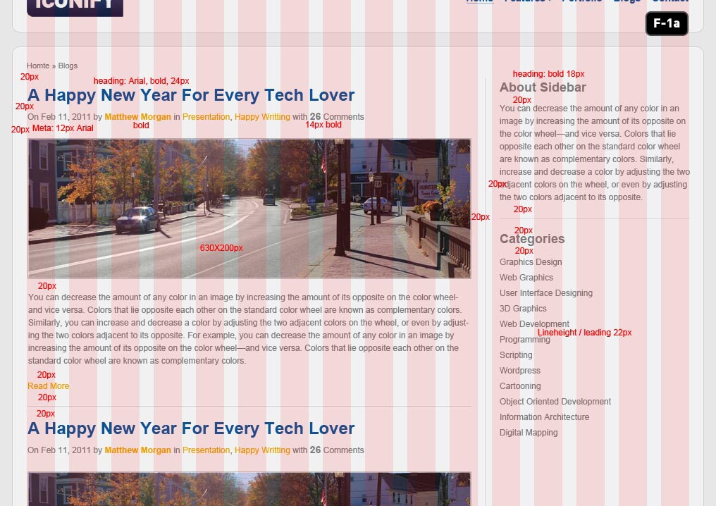
For the first time we’re going to use a standard two column blog layout – one for content and another one for the sidebar. Use image F – 1a as guideline to design the blog and sidebar content – notice that we’ve placed the vertical separation line between two of the column layers so it’s perfectly spaced.

The actual designing here is pretty simple so we’re not going to go into too much detail – just follow the set rules for the type layers (the red text on the examples), and use all of the styles that we’ve already setup in our other pages. Take special note about the spacing between elements (also marked in red text) as that’s going to tell you exactly where to place everything.

When you’re done, organize your layers as shown in image F – 1b.

F - 1b

Part G: Design the Blog Single Post Template

Now that we have our Blog List page setup, we need a template for each full blog post. This is a pretty hefty page in terms of content because we also need to plan ahead for a commenting system and lots of other little details. Pay special attention to the example images in this section!

Step G1: Creating Blog Posts Page

Once again, start by resaving the blogs.psd file with a name of blog-post.psd. Inside blog-post.psd, delete all the blog list content so we can start fresh. In the content section, grab your text tool and start to populate with some text and image as shown in image G – 1a.

Step G2: Design The Popular Blog Post Box

Draw a rectangle and apply the same layer styles of recent project‘s bar from the index.psd file. Populate it with content and position as shown in image G – 2a. For the horizontal ruler styles please check image G – 2b.

G - 2a
G - 2b

Step G3: Design The Comments Section

Draw a rectangle with 630px width and any height for now. Name it bg and place it inside a layer group named comments. Copy the layer styles from popular post box’s bg, then paste to this layer. Use image G – 3a as a guideline.

G - 3a

For the comment boxes’ arrows, draw a triangle inside the comment box (enable Add to shape area while drawing) measuring 10X10px rotate the arrow and position them as shown in image G – 3b and apply the layer styles as shown in image G – 3b.

G - 3b

We are leaving a 40px left margin for the second comment to indicate that this is a reply. By using this same technique, we can go even more deep – showing a third, fourth, or even fifth reply depth by just indenting another 40px for each level. We’ll do the same in our XHTML version, so remember these basic style rules.

Step G4: Design The Comment Form

Draw another rectangle with same style as of comments‘s bg layer and name this layer bg. Place it inside a layer group named comment form. Use image G – 4a as a guideline.

G - 4a
G - 4b
G - 4c

Part H: Design Contact Page

Once more time, copy blogs.psd and paste it with a name of contact.psd. Open it in Photoshop. Delete everything except breadcrumbs and sidebar from content layer group. Copy comment form and paste it as shown in image H – 1a. Once again, type in the content as shown in the image.

You’ll notice that a lot of this is repetition by now – we’re just copy/pasting in content, fitting it to the guides that we want to use, and using the same typography and layer styles from the previous pages.

Things should be moving pretty quickly by the time you’ve finished this page. You can repeat this same basic process for as many pages as you need to mockup – just stick to the column guides and use the same basic typographic and layer-style rules for each new design and should be able to knock any more of these that you might need very quickly.


End of Day 2

This concludes the second part of our massive tutorial! By now, we’ve successfully designed our website. In the next session (coming soon over at Nettuts), we’re going to begin the coding process, so check back here (and at Nettuts) as we post the new portions of this tutorial!