Understanding the F-Layout in Web Design
As the next part of our Web Design Layouts series, today we’re going to examine the “F Pattern Layout”; Rather than trying to force the viewer’s visual flow, the F-Layout gives in to the natural behaviors of most web surfers and it uses scientific studies to back it up. This tutorial will walk you through the principles of the F-Layout, why it works, and how you can create your own.
Như phần sau của loạt giao diện thiết kế website, một ví dụ khác đó là dạng "F",thay vì cố gắng để tạo ấn tượng ảo giác cho của người nhìn ,Giao diện F đc tạo ra dựa trên hành vi tự nhiên của hầu hết người lướt web và các nghiên cứu khoa học .
Attaining a better grasp of how different layouts can
change user behavior is one of the central principles
of creating an effective user experience. - Giúp nắm bắt tốt
hơn về cách bố trí khác nhau làm thay đổi hành
vi người dùng là một trong những nguyên tắc chính
tạo ra kinh nghiệm (hay thói quen cho người sử dụng
một cách có hiệu quả .
This post marks the second in a series where we’ll be examining the wide variety of layout paradigms that exist in the world of web design. The goal: to better understand why you might choose one layout concept over another. In this series, we’ll also be looking at the “Z” shaped layout, the open layout, and some out of the box layouts that are sure to give you some great ideas. Attaining a better grasp of how different layouts can change user behavior is one of the central principles of the creating an effective user experience.
Mục đích : để hiểu tốt hơn tại sao bạn có thể chọn một concept layout hơn cái khác.Trong loạt bài này , chúng ta cũng thấy Dạng giao diện Z là một giao diện mở, và một vài box giao diện chắc chắn sẽ cung cấp cho bạn những ý tưởng tuyệt vời .Bằng việc nắm bắt tốt hơn về cách bố trí khác nhau có thể thay đổi hành vi người dùng là một trong những nguyên tắc chính tạo ra kinh nghiệm cho người sử dụng một cách có hiệu quả.
Introducing the F-Layout
The F-Layout relies upon various eyetracking studies for it’s foundational concept. These scientific studies show that web surfers read the screen in an “F” pattern – seeing the top, upper left corner and left sides of the screen most… only occasionally taking glances towards the right side of the screen. These eyetracking studies argue in favor of placing the most important elements of your site (branding, navigation, call to action) on the left side of the design.
Giao diện F đc tạo ra dựa trên các nghiên cứu khoa học chuyển động của mắt ,đó là khái niệm nền tảng, Những nghiên cứu khoa học chỉ ra rằng những người lướt web theo một dạng kiểu F - đó là nhìn từ góc đầu phía trên bên trái ,bên trái màn hình ... chỉ thỉnh thoảng mới hướng sang bên phải màn hình .... do đó những nghiên cứu chuyển động thị giác lập luận ủng hộ việc đặt hầu hết các yếu tố quan trọng của trang web tại( branding(thương hiệu- logo ) , navigation, call to action - lệnh gọi hành động ) bên góc trên bên trái màn hình .
Let’s take a peek at a heatmap using Webdesigntuts+ as the example:
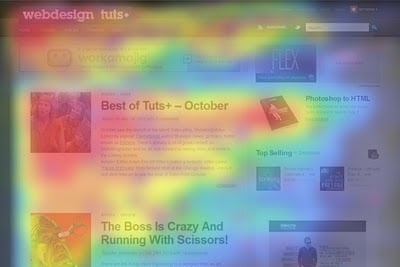
Allow me to walk you through the general behavior pattern: Mẫu chung về hành vi lướt web :
- Visitors start at the top left of the page - bắt đầu từ góc phía trên bên trái màn hình .
- Then they scan the top of the site (navigation, subscription, search, etc.) rồi họ lướt tới trên đỉnh nơi đặt navigation, subscription - lời chú thik , search -công cụ tìm kiếm , v...v )
- Next they move down, reading the next full row of content… all the way to the sidebar.Tiếp sau lướt xuống dưới, đọc tiếp các cột nội dung ...
- Last, surfers enter a “scanning pattern” once they hit the bulk of the site content . Cuối cùng , họ lướt lại một lượt các nội dung ...
Let’s take a moment to turn this pattern into a barebones wireframe: trong khung hình mô tả lại lộ trình mắt của ng lướt web trên một trang web dùng dạng F .

Take a moment to notice a few key behavioral patterns; Reading is largely done the same way that a book is read: top to bottom, left to right; Sidebar content is often dismissed below the “fold”, and usually is only scanned briefly. The bulk of the attention stays within the main content column where, in this case, the article listing is located.
Dừng lại một chút để chú ý một vài mẫu tiểu biểu của hành vị người dùng web; giống như một cách đọc 1 quyên sách theo lộ trình từ trên xuống dưới , từ trái sang phải. slide bar -thanh dẫn nội dung hay còn gọi là banner - thường chỉ đc lướt qua một chút ,phần lớn sự chú ý tập trung nằm trong cột nội dung chính ,trong tr hợp này thì đó là nơi danh sách bài viết .
A close inspection reveals a visual hierarchy that you might logically expect: hệ thống thị giác hợp lý mà bạn mong muốn :
- The brand-mark and navigation occupy the visitor’s attention first and foremost.Thương hiêu(logo) hoặc các nhãn hiệu thường chiếm sự chú ý của visitor đầu tiên và quan trọng nhất .
- Within the contest structure, images receive the greatest level of attention. Trong cấu trúc nội dung,hình ảnh nhận đc nhiều nhất mức độ sự chú ý .
- Headlines come next. Sau đó là tới tiêu đề
- Text appears to be scanned, not read thoroughly. văn bản thường chỉ dc đọc lướt qua, ,ko pải kiểu thấu đáo
Applying The F-Layout to a Design
Ứng dụng dạng F vào thiết kế
As an exercise, let’s walk through the creation of a design using the F-Layout.
First, let’s sketch out the rough placement of our main content elements using a wireframe method:
Trc tiên, hãy phác ra các vị trí mà ở đó chứa đựng nội dung thông tin chính bằng cách dùng các khung hình để định vị .như hình bên dưới - ở dạng F - thì các khung hình phần nào tạo cảm giác của chữ F - ở tại các khung hình phần lớn sẽ là hình ảnh ,còn lại là văn bản ,như đã nói thì h/ả thu hút phần lớn thị giác ng xem cũng như thẩm mỹ chung của một trang web !

Notice that we’re trying to make our primary “mission statement” as near to the top of the page as possible in an attempt to communicate the site’s purpose quickly. We’re also giving in to the visitors desire to “scan” content by breaking our design into two main columns… one for our primary content, the other for ancillary information (the sidebar).
Chú ý rằng chúng ta đang cố gắng để tạo một "tuyên ngôn rõ ràng " cơ bản ,ở phần đầu trang có thẻ như một cố gằng đưa ra mục đích giao tiếp một cách nhanh chóng .Chúng ta cũng đưa ra cho ng dùng web mong muốn lướt qua nội dung của bằng cách phá vỡ thiết kế trong hai cột chính : một cho nội dung chính cơ bản, và cột khác là cho các thông tin phụ trợ ở mỗi bên .
Next, let’s add some actual content to the design to see how it looks: thêm các thông tin thực tế vào thiết kế

It’s rough, but the key ingredients are there. You’ll notice that the main intent of the site is now communicated within a few seconds… the top row of content is now fulfilling it’s duty to “orient” the visitor; If your navigation is here, they also know where they can go.
đó là khó khăn,nhưng đó là thành phần chính. bạn sẽ nhận thằng mục đích chính của trang web bây giờ là truyền đạt trong một vài giây ... hàng trên cùng của nội dung hiện đang thực hiện việc định hướng cho visitor .Nếu thanh điều hướng Navigator đạt ở đây thì họ cũng sẽ nhận ra nơi bắt đầu .
Below the top row, we’re using images and “catchy” headlines to grab a surfer’s attention… even if they are only interested in scanning the content, there’s a good chance they’ll be able to find something of interest.
Bên dưới hàng đầu tiên ,chúng ta sử dụng hình ảnh và tiêu đề hấp dẫn để gây sự chú ý của ng dùng web... ngay cả nếu như họ chi bị thu hút bởi việc lướt qua nội dung, thì đây là một cơ hội tốt để tìm ra một điều j đó hấp dẫn .
We’re also trying to capitalize on the second-row of the “F” by placing an advertisement or “call to action” here (#4).
chúng ta cũng cố viết chữ hoa trên cột thứ 2 của dạng F bằng cách thêm vào đó một banner quảng cáo hoặc một button - call to action - lệnh gọi hành động .
Now, let’s overlay the original F-layout to see how we match up:

Not bad right? We might want to tinker with the details (styling, phrasing of the headlines, etc.), but for the most part we’re allowing the F-pattern scanning behavior to dictate our design.
không tồi chút nào ?chúng ta có thẻ muốn chắp vá với vài chi tiết như kiểu dáng, hay phân nhịp của các tiêu đề , nhưng ở hầu hết các phân đoạn thì ta muốn hướng hành vi lướt web của ng đọc theo chủ ý thiết kế của ta .
One thing to note here is that the height of each of the two rows on top of the “F” can be variable. Some designers might opt to leave them as thin as possible to encourage users to begin scanning right away; others might choose to make it a much more dominant part of the design.
Một điều chú ý ở đây là chiều cao của mỗi hai cột ở trên cùng của dạng F có thể thay đổi đc .vài nhà thiết kế thì chọn cách làm chúng mỏng như có thể để khuyến khích người đọc bắt đầu đọc lướt ngay lập tức, một số khác thì chọn làm chúng bị chi phối nh hơn các phần khác có thể .
What happens when you want to break the surfer out of the “scanning pattern” though? You certainly don’t benefit from a bored user if they begin to dull everything out, so let’s add one “awkward” element within the scanning area to keep the user interested.
Điều j xảy ra khi bạn muốn phá vỡ cách lướt web của người dùng ?bạn chắc chắn ko đc hưởng lợi từ một người dùng tẻ nhạt nếu họ trở nên kém thông minh , vậy hãy thêm một yếu tố "vụng về " vào giữa khoảng đọc lướt của ng dùng để giũ sự thu hút đó .thực ra đó là thêm nội dung hoặc hình ảnh đi kèm thêm phần sinh động và hấp dẫn ,trong ảnh dưới đó là phần nội dung ở giữa trang ,vừa mang tính thẩm mỹ giảm sự nhàm chán đồng thời cũng chia tách nội dung nổi bật ở trên với nội dung cũ hoặc ko quan trọng ở dưới .

This technique of “breaking the expectations” of the layout can be useful when you have really long vertical spans of content that feel dull or boring once you scroll past the first couple headlines. By throwing the viewer a curveball, you can keep the users moving around your site by providing visually interesting elements 1000, 2000, even 3000 pixels below the fold.
Kỹ thuật này là " phá bỏ sự nhàm chán " của bố cục ,có thể hữu ích khi nội dung của bạn thực sự trải dài sẽ khiến ng lướt thấy buồn tẻ hoặc nhàm chán khi đã lướt qua một vài tiêu đề . Như một "cú phát bóng ", bạn có thể giữ ng đọc web di chuyển xung quanh trang của bạn bằng cách cung cấp những yếu tố thị giác thú vị 1000,2000, hay thậm chí 3000 pixels bên dưới mỗi nếp gập .
Why it Works
The F-Layout works because it allows web-surfers to scan content naturally. The layout feels comfortable because people have been reading top to bottom, left to right for their entire lives. The implications of this behavioral pattern are something of a double-edged sword though:
Dạng F làm việc bởi nó cho phép người dùng web có thể đọc lướt nội dung một cách tự nhiên .Giao diện trông thuận tiện bởi mọi ng có thể đọc từ trên xuống dưới và từ trái sang phải theo cách tự nhiên .Ý nghĩa mẫu hành vi là một điều j đó như một con dao hai lưỡi, mặc dù :
- If you need to say something, you absolutely must say it at the top, because…nếu bạn cần phải nói điều j đó,bạn hoàn toàn pải nói nó ở trên ,bởi ...
- Users aren’t going to read each and every word on the page. In fact, most readers won’t really even bother reading the excerpt of an article. Anything past a headline is probably only going to be there for SEO purposes. người dùng sẽ không đọc mỗi từng từ trên trang. trên thực tế, hầu như ng đọc sẽ ko thực sự đọc ngay cả đoạn trích của đoạn văn bản .bởi bất cứ điều j trên tiêu để sẽ chỉ phục vụ cho mục đích SEO( search engine organizing ) công cụ tìm kiếm trực tuyến .
- Images and Headlines are only reliable if they are interesting and Hình ảnh và tiêu đề chỉ chắc chắn và đáng tin cậy khi chúng thu hút và hấp dẫn .
If this all sounds like you’re designing a site more like an advertiser would than a designer, you’d be right. Most sites that rely heavily on the F-Layout also rely on advertising or other “call to action” pitches in the sidebar to drive revenue or some other sort of user-engagement. This isn’t necessarily a bad thing (hey, are those advertisements over there on our sidebar?!), but it does underline the relationship between the content and the sidebar… the content is king, the sidebar is usually there to get you involved in something that will take you to another level.
,đoạn này đại để là đm cái thằng viết ,cụ thể là mối quan hệ giữa việc đặt banner quảng cáo với nội dùng bên trong và rằng quảng cáo sẽ giúp thêm thu nhập cho trang web nhưng bên cạnh đó nội dung vẫn là chính và banner hay sidebar thì chỉ phụ thêm vào bố cục .
So what does this mean for a sidebar? An effective relationship between content column and sidebar column in a design will utilize the sidebar in one of two ways:
Vậy thanh bên có nghĩa là j ? Hiệu quả quan hệ giữa cột nội dung và cột thanh bên trog thiết kế sẽ dùng theo một trong hai cách sau :
- To feature “relevant” content. This could be an advertisement, a listing of “related articles”, a Social Media widget, etc... tính năng liên quan tới nội dung .đây có thể là một banner quảng cáo,một danh sách bài viết liên quan, hay một công cụ truyền thông xã hội (social media)
- As a tool for users to find specific content. The obvious example is a searchbar, but it would also be a category listing, a tag cloud, a “popular posts” widget, etc. như một công cụ để tìm thấy nội dung rõ ràng. một ví dụ rõ ràng hiển nhiên là một thanh công cụ tìm kiếm search bar , nhưng nó cũng chỉ như một danh mục, một tag cloud, một công cụ chung chung ...
The Chicken or the Egg?
So which came first? Was the F-Layout designed in response to people scanning sites in the F-Pattern, or did web-surfers begin scanning pages in the F-Pattern as a response to so many sites being designed that way… My personal guess is that it’s a little bit of both. Yes, people have always been reading top-to-bottom, left-to-right; but the prevalence of the 2-column site layout certainly encourages website visitors to scan the way that they do.
Dạng F đc tạo ra để đáp ứng nhu cầu người lướt web trc hay để bắt đầu tạo ra thói quen theo hành vi lướt web như những trang web đc thk theo cách đó ?theo thói quen mng hay đọc một cách logical thì kiểu phổ biến nhất là giao diện có hai cột chắc chắn đảm bảo làm ng dùng web sẽ lướt theo cách họ thương làm .
The simple fact is that the F-Pattern is supported by research, so whether or not you want your layout to adhere closely to it, it’s worth at least considering how visitors will react to your site if they do prefer to “F-scan” the web.
thực tế đơn giản là mẫu giao diện F đc tạo ra trên những nghiên cứu ,vậy thì muốn hay không thì giao diện của bạn sẽ tôn trọng triệt để cái nghiên cứu này ,nó có giá trị ít nhất là xem xét làm sao để ng dùng web sẽ phản ứng theo cách họ dùng .
Examples of the F-Layout in Action
Ok, so before I actually list these, it’s worth saying that just about any website setup on the traditional 2-column blog layout is using a “F-Pattern” layout, so it’s almost too predictable to show you more sites that use the standard F-pattern.
What we are going to look at in these examples is how each of these designs excels at manipulating the F-pattern eye-flow… notice that the most effective designs are those that anticipate the F-pattern scanning behavior, and then use it to their advantage.
nhứng j ta sẽ đc thấy trong các ví dụ bên dưới đó là làm thế nào mỗi thiết kế nổi trội với dạng F thuận mắt ... chú ý rằng hàu hết hiệu quả thiết kế này là đoán trc những hành vi lướt dạng F .


Caveats Worth Mentioning
There are drawbacks to relying too heavily on the “F-Pattern” as your design foundation. For one, designs that stick too closely to the F-layout can feel boring and predictable… to combat this, you as a designer will have to bring a certain level of innovation to the table. Well designed sidebar widgets, catchy headlines, and engaging images are all useful tricks, but you’ll likely want to take it a step further.
Once you dip below the top two rows of the “F”, it often becomes a challenge to a designer to keep things interesting. I’ve found that lots of designers sell the top 600px of a site to their clients… this is all fine and well (it is what visitors see first), but the lessons of the F-layout are that it’s also important to keep things interesting as you begin to scroll down.
Just like a song that has one-steady beat might give you a headache, a page can often become dull and repetitive if you don’t bother to throw in an interesting element now and again. Breaking the rhythm of a design by limiting repetitious elements is a crucial technique that you’ll want to design into your sites to bring your work to the next level.
Be sure to check out the “Z-Layout” post as well!
Have your own thoughts or comments? Share them down below!