15 thg 5, 2010
Logo Design Love: the unsung heroes | Logo Design Love
Logo Design Love: the unsung heroes | Logo Design Love
One of my biggest regrets during the Logo Design Love book project was being unable to feature every contributor. It had been necessary to set the book’s maximum page count back when the contract was signed, so it was impossible to tell just how much room there’d be for each contributor until the writing/editing was complete.
As a belated “thank you” to the graphic designers who helped, but who weren’t shown in the book, here’s a sample of work readers won’t have seen.
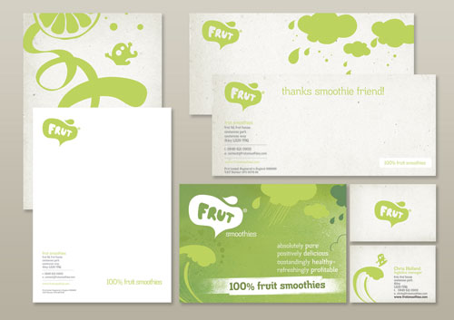
frut, by adamgf
![]()
“I was approached to create a new logo and artwork for smoothie company, frut. I pitched two branding packages — one playful and energetic, the other classy and sophisticated — and was able to steer my client to the logo I thought best suited the fun and playful personality and vision. But the client wanted to mix and match artwork elements from both pitches, which I felt were incompatible.
“In this case, my favourite concept was chosen but was almost too risky for the company to take on. They felt better combining some safe options in the design. I battled to keep the brand strength from the outset, swallowed my pride on plenty of occasions and ultimately was able to convince the client to fully embrace the right logo for them.”
— ADAM GF
![]()
Aeroplano, by NNSS
![]()
The NNSS website. NNSS was previously featured on Logo Design Love.
Logo Review, by Sean Farrell
![]()
“When the Logo Review company approached me to create a design, their main requirement was that the logo be effective and in the simplest form possible. I decided early on that a check mark would be included in the logo and initially went in the direction of an icon drawing a few sketches of check marks in a variety of different formats.
“Some of the icon sketches weren’t strong enough, so I took the direction of making a stronger logo type, trying to form a check mark out of a variety of letters until deciding upon the “v” as the perfect solution. I slivered off the top left part of the “v” and kerned the letters appropriately, making for a very simple but effective design.”
— SEAN FARRELL
![]()
Br&ing, by Gareth Hardy
![]()
“I was commissioned by a company that offered complete branding packages, everything from naming services to professional design solutions. The brief stated that the word “branding” had to be illustrated within the design.
“Branding is a means of visually communicating a message, so I thought about replacing one of the letters with a symbol. The ampersand effectively helped to further reduce the length of the name. Various versions of the wordmark were presented upon requests but all were eventually rejected. Luckily, another entrepreneur with a similar business model decided to purchase the identity, which was slightly refined even further.”
— GARETH HARDY

Gareth Hardy was previously featured on Logo Design Love.
BEMBI, minimum, and Play, by Kliment Kalchev
![]()
BEMBI — Bulgarian concrete mixtures supplier.
![]()
minimum — design agency.
![]()
PLAY — motion design studio.
Attack Concerts, by Kostadin Kostinadov


“Attack Concerts is a company organizing concerts in Russia and the eastern block. During the project I sank myself in the atmosphere of a live show as best as I could. As well as my usual methods of brainstorming, mind maps and trying to change my work location often, I also listened and watched a lot of live performances.
“I had a vision of a lonely microphone-stand under the spotlight, but with a nice twist — the whole shape was that of the letters A and C for Attack Concerts stacked over each other. Simple and elegant yet meaningful and smart. I quickly sketched it on one of the papers I had on my desk and later the same day started perfecting it on my computer.
“The idea was a product of a long work process, looking at hundreds of concert pictures and studying the possible shapes and letter combinations in the company name.
“Note for the sketch of the final logo: I use different colored paper when sketching ideas in order to introduce some variety in my brainstorming process and to stimulate my mind.”
— KOSTADIN KOSTINADOV

Forestal Caja Bancaria, by KYC


Select, by Tom Crawshaw
![]()

Tom Crawshaw’s website appears to be down, unfortunately.
Sickday, by YYES
![]()
“Started as a one-woman business providing medical house calls throughout Manhattan, Sickday was growing to a point where it needed an identity that befitted its expanding market position and high-end market. Founder Naomi Friedman, herself one of the most compassionate and caring individuals you’d ever meet, recognized the need for a professional identity but didn’t want to lose sight of what makes the brand special: its uniquely personal touch.
“After literally hundreds of sketches and many, many discussions about what the brand represented to her and her clients, which includes Park Avenue celebrities as well as underprivileged children, the simple and elegant solution of a bandage folded into a heart emerged. It represents perfectly what the brand does: come directly to your home or office, diagnose common ailments, and put you back together again to continue your day, all with the care of a loving mother.”
— DESIGNED BY RON FLEMING & BRENT STICKELS
![]()
Thanks once again
13 thg 5, 2010
4 thg 5, 2010
What makes a good logo?
What makes a good logo?
Published on Monday, July 27, 2009 – 1:54 pm
What makes a good logo? A good logo is distinctive, appropriate, practical, graphic, simple in form and conveys an intended message.
There are five principles that you should follow to ensure that this is so…
An effective logo is (in no particular order):
- Simple
- Memorable
- Timeless
- Versatile
- Appropriate
1. Simple

A simple logo design allows for easy recognition and allows the logo to be versatile & memorable. Good logos feature something unique without being overdrawn.
While in college in the mid-70’s an instructor introduced me to the K.I.S.S. Principle of design; which translates to: Keep It Simple, Stupid. It does convey a very important design consideration. Simple logos are often easily recognized, incredibly memorable and the most effective in conveying the requirements of the client. A refined and distilled identity will also catch the attention of a viewer zipping by signage at 70 miles per hour, on packaging on the crowded shelves of a store, or in any other vehicle used for advertising, marketing and promotion. Remember, the basis of the hugely effective international branding for the world’s largest shoe manufacturer is a very simple graphic swoosh.
2. Memorable

Following closely behind the principle of simplicity, is that of memorability. An effective logo design should be memorable and this is achieved by having a simple, yet, appropriate logo.
You may be interested to see some examples of bad logo designs.
Surprising to many, the subject matter of a logo is of relatively little importance, and even appropriateness of content does not always play a significant role.
This does not imply that appropriateness is undesirable. It merely indicates that a one-to-one relationship between a symbol and what it symbolized is very often impossible to achieve and, under certain conditions, objectionable. Ultimately, the only mandate in the design of logos, it seems, is that they be distinctive, memorable, and clear.
3. Timeless
![]()
An effective logo should be timeless – that is, it will stand the test of time. Will the logo still be effective in 10, 20, 50 years?
Leave trends to the fashion industry – Trends come and go, and when you’re talking about changing a pair of jeans, or buying a new dress, that’s fine, but where your brand identity is concerned, longevity is key. Don’t follow the pack. Stand out.
Probably the best example of a timeless logo is the Coca-Cola logo… if you compare it to the Pepsi logo below, you can see just how effective creating a timeless logo can be. Notice how the Coca Cola logo has barely changed since 1885? That is timeless design.
Update: 8/08/09 – Underconsideration has posted an updated timeline of the Pepsi vs CocaCola logo. Thanks for the tip off Jon.

4. Versatile

An effective logo should be able to work across a variety of mediums and applications. For this reason a logo should be designed in vector format, to ensure that it can be scaled to any size. The logo should be able to work both in horizontal and vertical formats.
Ask yourself; is a logo still effective if:
- Printed in one colour?
- Printed on the something the size of a postage stamp?
- Printed on something as large as a billboard?
- Printed in reverse (ie. light logo on dark background)
One way around creating a versatile logo is to begin designing in black and white only. This allows one to focus on the concept and shape, rather than the subjective nature of colour. One must also remember printing costs – the more colors used, the more expensive it will be for the business over the long term.
I like to work first in black and white to ensure that the logo will look good in its simplest form. Color is very subjective and emotional. This can distract from the overall design – say if you saw your logo in all red, that color may be the first thing that you respond to and not the composition of the design elements. I will not even consider submitting color suggestions to a client for review until they have signed off on a final black and white logo.
One should also familiarise themself with the commercial printing process so as not to come into printing problems further down the track. Learn to know the difference between the CMYK, Pantone and RGB color systems. When designing logos, the Pantone colour system is recommended.
5. Appropriate

How you position the logo should be appropriate for its intended purpose. For example, if you are designing a logo for children’s toys store, it would be appropriate to use a childish font & colour scheme. This would not be so appropriate for a law firm.
It is also important to state that that a logo doesn’t need to show what a business sells or offers as a service. ie. Car logos don’t need to show cars, computer logos don’t need to show computers. The Harley Davidson logo isn’t a motorcycle, nor is the Nokia logo a mobile phone. A logo is purely for identification.
For further evidence of this, take the top 50 brands of the world – 94% of the logos do not describe what the company does.
Paul Rand also has a say on this topic:
Should a logo be self-explanatory? It is only by association with a product, a service, a business, or a corporation that a logo takes on any real meaning. A logo derives its meaning and usefulness from the quality of that which it symbolizes. If a company is second rate, the logo will eventually be perceived as second rate. It is foolhardy to believe that a logo will do its job immediately, before an audience has been properly conditioned.
What makes a great logo in your opinion?
Recommended logo design resources:
- The Ultimate List of Logo Design Resources
- Top 10 Logo Design Inspiration Galleries
- How NOT to design a logo
For the extended version of this article visit Smashing Magazine: “Vital Tips for Effective Logo Design” .
sources : http://justcreativedesign.com
3 thg 5, 2010
Young Wedding !


The groom is my friend who i meet along time. and bride who i first time i ever meet, but she is sociable girl and very young. that is a great day shooting. i'm very happy with these picture .
Processing and design by me & friends ! ^^
Hope u like it !
1 thg 5, 2010
Wedding album !


 This is wedding album ,i created for my friends .
design by me
photo by hoanghai (ximun)
Đăng ký:
Bài đăng (Atom)