Design and visual art provide visual communication language between the artist and the viewers to deliver message or idea through the viewers eyes’ contact with the visual elements in the design, photo or artwork.
Before continuing reading this post did you already join our Twitter and subscribe to our RSS feed? If not, rush and join us now to receive updates of new posts and free resources.
However, there are some rules that control the relation between the eye and visual elements and allow better communication between them without lose of any information or misleading the visual communication flow. Through the ages of art history, there are basic rules that are applied in different visual artwork to control this relation between the artwork and the audience.
Although the idea is important in delivering the art concept or the design idea, using these rules ensure the delivery for the design idea. There are great design ideas that users even do not look at it because it is either noisy or complicated…etc.
However, in this article we will discuss the basic design principle that forms the first steps that you should consider when creating a design or artwork.
Simplicity
The first rule is to be simple. Complicated ideas and designs do not get but standing alone with no one attracted to it and this is the last thing you want when you create a design and artwork. Although some designs may require complicated visual form, but it is not the rule, and it follows specific circumstances.
The design simplicity applies not only on the design elements used in the design, but also applies to the number of colors, lines, curves, light and shadows in the design. For example, the design many include limited number of images, but in the same time, it includes a lot of colors that make the overall design complicated and not simple for the eye of the audiences.
In the below example, you can notice that this digital art consists of only one tree object and the design colors are in monochrome style, which simplify the number of colors in the design.

Design by Rafiq Elmansy
The Rule of Thirds
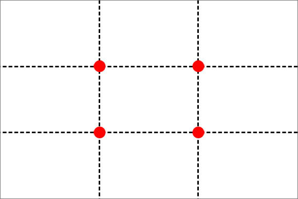
The rule of thirds divides any visual design or artwork to two vertical lines and two horizontal lines, each of the created thirds are equal in size and dimensions. These four lines create four intersected points on the design as you can see in the figure below.

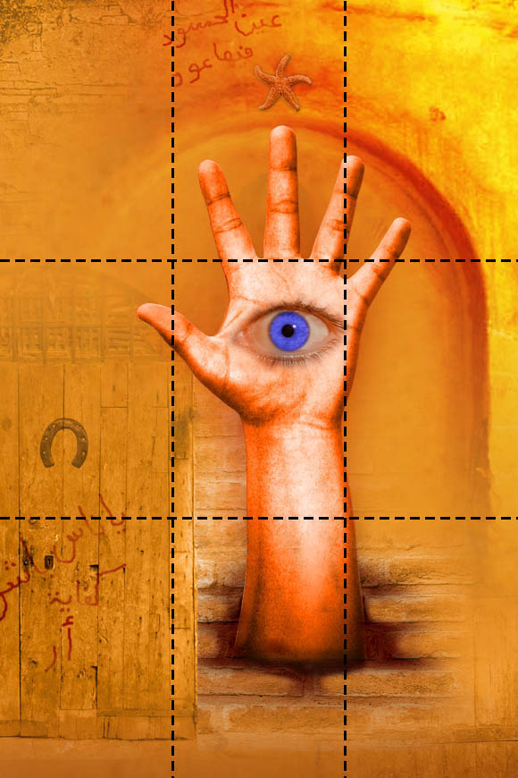
The rule tells us that the most attractive areas in the design are the areas where the design element intersected with two of either the vertical or the horizontal thirds such as the example below.

Design by Rafiq Elmansy
This is one of my digital artwork that I have done couple of years ago based on ancient Egyptian motives about envy. You can notice that the most important part in artwork is the hand and the blue eye inside it. However, this part is placed in the top two thirds and continues to flow to the bottom of the image.
Why to Use the Rule of Thirds
The idea behind applying the rule of thirds is that the center of the first common place where to add the elements in the image. When the objects are places on a different place other than the image center. The human eye attracts to the objects around the center of the image that are located in any of the four points where the thirds lines intersect.
You can use the rule of thirds to get the viewer attention to specific part in the design or certain words.

Design by Rafiq Elmansy
The above design adds the most the important part of the text in the bottom two thirds where the rest of the words are spread all over the design with different sizes and opacity values.
How to Apply the Rule of Thirds
The rule of thirds is a guide to get the attention of the eye when it first looks to the design, photo or artwork. However, it is not required to exactly put the image in the exact center of the intersected thirds lines. You just put the object in the nearest two horizontal or vertical thirds.
Some thirds are better than other in some specific topics. For example, the horizontal thirds are suitable for the landscape painting or photography, because this is following the natural vanishing point for the landscape distance.
On the other hand, use the vertical thirds in portrait photography or in adding vertical objects such as trees …etc.
Harmony
This concept refers to the unity of the design and having all the design elements compliant with the each other. The design elements should be natural and arranged with each other. For example, when they take a photo for a landscape, the photo elements should be related to each other and does not have a strange object in the photo.
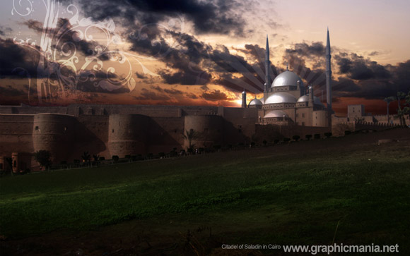
The Harmony concept goes beyond the objects in the design and photo. You can apply the harmony concept in the colors and image style such as the below example.

Design by Rafiq Elmansy
I took this photo for Saladin citadel in Cairo Egypt. And I choose to apply the colors to the image to give it more ancient feel through dramatic light effect on the photo.
Contrast
The contrast in design depends on the differentiation between colors and objects to attract the viewer to specific part or object in the design or the photo. The contrast can be applied using colors by giving the object of focus different color than the general scheme of the design. For example, you can use the white color over black background to get the attraction to the white area in the design.
The following photo shows a contrast between the white flower and the environment around it to get the eye attraction to the flower object as the most important part on the photo.

Photography by Radwa Samir
Movement
Although the still images do not include animation or movement, but the movement concept refers to give the objects in the design a moving action. For example, when you take a photo for standing people, make sure to let them appear as they are not frozen statues. They can do some kind of action or movement to break bored standing still position.

Photography by Radwa Samir
In the above photo for me and my two daughters, all of us are doing an action and appear like moving.
Conclusion
The above rules guide you while building your design or artwork to the best methods to communicate well with the viewer eyes to deliver your idea or concept clean and with all the possible means such as the colors, objects, lights and shadows.
These guides are not restricted rules; on the other hand, these rules are just guidelines for you to follow. You can apply any of these rules or all together based on your needs in the design
source : graphicmania.net