Final Product What You'll Be Creating

Today, in part 2 of this massive tutorial, we’re continuing this session with the second day of design. We’vealready designed the homepage – so now we’ll be designing the four support pages that form the rest of the complete site design (Portfolio, Blog List, Blog Post, and the Contact Form Page). Let’s dive in shall we?
About the Mini Series
You’ll find lots of web design and development tutorials out the net… but very few tuts that take you from start to finish. Lots of tutorials are only for design, and others are only for coding. Today we’re starting a new series where we’ll design and develop a complete website from scratch; We’ll take you from the initial wireframe to the full site design (including 5 pages). Then we’ll be coding the design (in Nettuts of course) and finally converting this complete XHTML theme to a working WordPress theme!
Check out the entire process as it happens at our Session Page!
Project Objectives!
Let’s briefly review our project objectives that we set up on Day One:
Our aim is to design and develop a simple site design with a modern layout that’s conducive to CMS systems like WordPress. We won’t be applying any wild and crazy style effects in our design (the point here is to keep it simple), but we are going to approach the entire process, from start to finish, as a study in layout and a proper use of margins and padding.
We’ll be using the 960 grid system from start to finish – and this won’t be any different for our Day Two design session.
A Brief Course Outline. We might break this up differently once we hit the coding phase, but this should give you a good idea of where we’re heading with this series:
- The Design Phase
- Session 1: Laying The Groundwork and Designing the Homepage
- Session 2: Designing the Support Pages (You’re reading it now!)
- The Coding Phase
- Session 3: Slicing and XTHML Coding (Available Soon)
- Session 4: Convert To a WordPress Theme (Available Soon)
Let’s Continue! Day Two of the Design Phase
Let’s start by taking a peek at what we’ll be creating:
- Homepage [Done]
- Portfolio [Today]
- Blog List Page [Today]
- Blog Post Page [Today]
- Contact [Today]
Today’s design phase is also divided in four parts and we’ll design all the other pages of Iconify in this session. As we designed the homepage already, our primary task has been completed – so we just need to fill in the blanks for the rest of the sitemap.
This is a crucial step that’s often overlooked in lots of design projects, but designing some specifications for these support pages is something you won’t want to skip. Remember, a website design isn’t complete after just setting up the homepage – at the very least you’ll need a couple extra templates designed for the additional pages that make up a site.
As our layout is pretty straight forward, we’ll just be swapping out the primary content area for each page. The universal site elements (Header, Navigation, Footer) will all stay the same from one page to the next. This is important to keep a consistent foundation for the site so users always know where they’re at.
Part E: Design the Portfolio Page
The Portfolio Page is the first support page that we’ll design. Remember that we’re using the 960 Grid System for the entire site design, so we’ll be using the same basic layout and column structure as we setup on the homepage design.
Step E1: Basic Setup For Portfolio Page
Create a duplicate of the index.psd file and rename it to portfolio.psd. Open it up with Photoshop. Delete everything from within content layer group except the bg layer.
Now create the “breadcrumbs” and “notes” layers for the portfolio page. For the “notes” background shape, use the same layer styles as we did it for recent project‘s bar rectangle. Use image E – 1a as a guideline.

Next, we are going to use a simple technique to work in a handful of different column variations inside this one page for our portfolio items.
Step E2: Creating Portfolio Items
Use the image creation technique from Day One (Step C3) to create two column portfolio items as shown in image E – 2a. If you recall, we’re simply drawing in rectangles that fit the column guides, applying a layer style, and then cropping in images to create a subtle border effect.
Now repeat this same technique for three column and four column portfolio items. Use image E – 2b and E – 2c as a guideline. Note that we’re flipping between the different 12_column and 16_column guide layers to get this perfect. Finally, organize your layers as shown in image E – 2d.


Part F: Design The Blog List Page
The Blog List page is intended to be the location where “excerpts” of each blog post are shown. These “excerpts” are also called “loop” elements – and usually are comprised of a title, thumbnail image, a short text preview and some meta information (like the date, author, tags, etc.).
Step F1: Creating the Blop “Loop” Elements
Just like we did with the last page, we’ll start by creating a duplicate of portfolio.psd page and renaming it to blogs.psd. Inside the blogs.psd file, delete everything inside the content folder except bg,breadcrumbs, and pages layers. Now we have a blank blogs file, we can begin to populate it with some content.
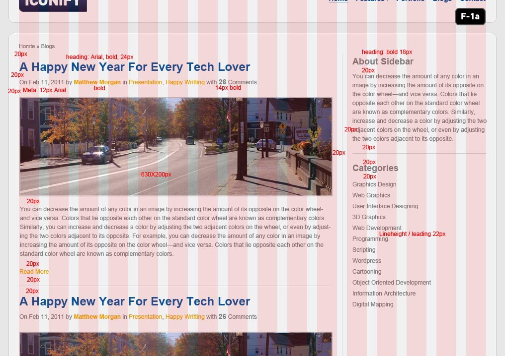
For the first time we’re going to use a standard two column blog layout – one for content and another one for the sidebar. Use image F – 1a as guideline to design the blog and sidebar content – notice that we’ve placed the vertical separation line between two of the column layers so it’s perfectly spaced.
The actual designing here is pretty simple so we’re not going to go into too much detail – just follow the set rules for the type layers (the red text on the examples), and use all of the styles that we’ve already setup in our other pages. Take special note about the spacing between elements (also marked in red text) as that’s going to tell you exactly where to place everything.
When you’re done, organize your layers as shown in image F – 1b.

Part G: Design the Blog Single Post Template
Now that we have our Blog List page setup, we need a template for each full blog post. This is a pretty hefty page in terms of content because we also need to plan ahead for a commenting system and lots of other little details. Pay special attention to the example images in this section!
Step G1: Creating Blog Posts Page
Once again, start by resaving the blogs.psd file with a name of blog-post.psd. Inside blog-post.psd, delete all the blog list content so we can start fresh. In the content section, grab your text tool and start to populate with some text and image as shown in image G – 1a.

Step G2: Design The Popular Blog Post Box
Draw a rectangle and apply the same layer styles of recent project‘s bar from the index.psd file. Populate it with content and position as shown in image G – 2a. For the horizontal ruler styles please check image G – 2b.


Step G3: Design The Comments Section
Draw a rectangle with 630px width and any height for now. Name it bg and place it inside a layer group named comments. Copy the layer styles from popular post box’s bg, then paste to this layer. Use image G – 3a as a guideline.

For the comment boxes’ arrows, draw a triangle inside the comment box (enable Add to shape area while drawing) measuring 10X10px rotate the arrow and position them as shown in image G – 3b and apply the layer styles as shown in image G – 3b.

We are leaving a 40px left margin for the second comment to indicate that this is a reply. By using this same technique, we can go even more deep – showing a third, fourth, or even fifth reply depth by just indenting another 40px for each level. We’ll do the same in our XHTML version, so remember these basic style rules.
Step G4: Design The Comment Form
Draw another rectangle with same style as of comments‘s bg layer and name this layer bg. Place it inside a layer group named comment form. Use image G – 4a as a guideline.


Part H: Design Contact Page
Once more time, copy blogs.psd and paste it with a name of contact.psd. Open it in Photoshop. Delete everything except breadcrumbs and sidebar from content layer group. Copy comment form and paste it as shown in image H – 1a. Once again, type in the content as shown in the image.
You’ll notice that a lot of this is repetition by now – we’re just copy/pasting in content, fitting it to the guides that we want to use, and using the same typography and layer styles from the previous pages.

Things should be moving pretty quickly by the time you’ve finished this page. You can repeat this same basic process for as many pages as you need to mockup – just stick to the column guides and use the same basic typographic and layer-style rules for each new design and should be able to knock any more of these that you might need very quickly.
End of Day 2
This concludes the second part of our massive tutorial! By now, we’ve successfully designed our website. In the next session (coming soon over at Nettuts), we’re going to begin the coding process, so check back here (and at Nettuts) as we post the new portions of this tutorial!