One of my biggest regrets during the Logo Design Love book project was being unable to feature every contributor. It had been necessary to set the book’s maximum page count back when the contract was signed, so it was impossible to tell just how much room there’d be for each contributor until the writing/editing was complete.
As a belated “thank you” to the graphic designers who helped, but who weren’t shown in the book, here’s a sample of work readers won’t have seen.
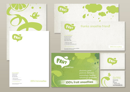
frut, by adamgf
![]()
“I was approached to create a new logo and artwork for smoothie company, frut. I pitched two branding packages — one playful and energetic, the other classy and sophisticated — and was able to steer my client to the logo I thought best suited the fun and playful personality and vision. But the client wanted to mix and match artwork elements from both pitches, which I felt were incompatible.
“In this case, my favourite concept was chosen but was almost too risky for the company to take on. They felt better combining some safe options in the design. I battled to keep the brand strength from the outset, swallowed my pride on plenty of occasions and ultimately was able to convince the client to fully embrace the right logo for them.”
— ADAM GF
![]()
Aeroplano, by NNSS
![]()
The NNSS website. NNSS was previously featured on Logo Design Love.
Logo Review, by Sean Farrell
![]()
“When the Logo Review company approached me to create a design, their main requirement was that the logo be effective and in the simplest form possible. I decided early on that a check mark would be included in the logo and initially went in the direction of an icon drawing a few sketches of check marks in a variety of different formats.
“Some of the icon sketches weren’t strong enough, so I took the direction of making a stronger logo type, trying to form a check mark out of a variety of letters until deciding upon the “v” as the perfect solution. I slivered off the top left part of the “v” and kerned the letters appropriately, making for a very simple but effective design.”
— SEAN FARRELL
![]()
Br&ing, by Gareth Hardy
![]()
“I was commissioned by a company that offered complete branding packages, everything from naming services to professional design solutions. The brief stated that the word “branding” had to be illustrated within the design.
“Branding is a means of visually communicating a message, so I thought about replacing one of the letters with a symbol. The ampersand effectively helped to further reduce the length of the name. Various versions of the wordmark were presented upon requests but all were eventually rejected. Luckily, another entrepreneur with a similar business model decided to purchase the identity, which was slightly refined even further.”
— GARETH HARDY

Gareth Hardy was previously featured on Logo Design Love.
BEMBI, minimum, and Play, by Kliment Kalchev
![]()
BEMBI — Bulgarian concrete mixtures supplier.
![]()
minimum — design agency.
![]()
PLAY — motion design studio.
Attack Concerts, by Kostadin Kostinadov


“Attack Concerts is a company organizing concerts in Russia and the eastern block. During the project I sank myself in the atmosphere of a live show as best as I could. As well as my usual methods of brainstorming, mind maps and trying to change my work location often, I also listened and watched a lot of live performances.
“I had a vision of a lonely microphone-stand under the spotlight, but with a nice twist — the whole shape was that of the letters A and C for Attack Concerts stacked over each other. Simple and elegant yet meaningful and smart. I quickly sketched it on one of the papers I had on my desk and later the same day started perfecting it on my computer.
“The idea was a product of a long work process, looking at hundreds of concert pictures and studying the possible shapes and letter combinations in the company name.
“Note for the sketch of the final logo: I use different colored paper when sketching ideas in order to introduce some variety in my brainstorming process and to stimulate my mind.”
— KOSTADIN KOSTINADOV

Forestal Caja Bancaria, by KYC


Select, by Tom Crawshaw
![]()

Tom Crawshaw’s website appears to be down, unfortunately.
Sickday, by YYES
![]()
“Started as a one-woman business providing medical house calls throughout Manhattan, Sickday was growing to a point where it needed an identity that befitted its expanding market position and high-end market. Founder Naomi Friedman, herself one of the most compassionate and caring individuals you’d ever meet, recognized the need for a professional identity but didn’t want to lose sight of what makes the brand special: its uniquely personal touch.
“After literally hundreds of sketches and many, many discussions about what the brand represented to her and her clients, which includes Park Avenue celebrities as well as underprivileged children, the simple and elegant solution of a bandage folded into a heart emerged. It represents perfectly what the brand does: come directly to your home or office, diagnose common ailments, and put you back together again to continue your day, all with the care of a loving mother.”
— DESIGNED BY RON FLEMING & BRENT STICKELS
![]()
Không có nhận xét nào:
Đăng nhận xét