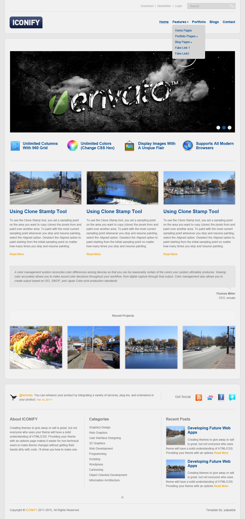
Final Product What You'll Be Creating
You’ll find lots of web design and development tutorials out the net… but very few tuts that take you from start to finish. Lots of tutorials are only for design, and others are only for coding. Today we’re starting a new series where we’ll design and develop a complete website from scratch; We’ll take you from the initial wireframe to the full site design (including 5 pages). Then we’ll be coding the design (in Nettuts of course) and finally converting this complete XHTML theme to a working WordPress theme!
Project Objectives!
Our aim is to design and develop a simple site design with a modern layout that’s conducive to CMS systems like WordPress. We won’t be applying any wild and crazy style effects in our design (the point here is to keep it simple), but we are going to approach the entire process, from start to finish, as a study in layout and a proper use of margins and padding.
We’ll be using the 960 grid system from start to finish, so if you’ve ever wondered what it’s like to use the system, now’s a great time to learn! We’ll be making a few deviations from the norm, but for the most part we’ll be using 960gs in the design and coding phases.
Once you guys/gals are done, you’re welcome to customize the design all you want with your own fonts, colors, styles and textures! Remember, this is just a starting out point – you’re welcome to go as nuts as you want when it comes to the personality of your own version of the design.
A Brief Course Outline. We might break this up differently once we hit the coding phase, but this should give you a good idea of where we’re heading with this series:
- The Design Phase
- Session 1: Laying The Groundwork and Designing the Homepage
- Session 2: Designing the Support Pages (Available Next Week)
- The Coding Phase
- Session 3: Slicing and XTHML Coding (Available Soon)
- Session 4: Convert To a WordPress Theme (Available Soon)
Resources Used For This Project
You can use your own resources if you’d like, but here’s the full list of the images and icons that I’ve used in the tutorial:
- Images – Lil Rhody Dan, Flickr
- Merry Christmas (photo)- from PSDTuts flickr group
- Social Icons – wefunction
- Twitter Bird – webtreats
- Use these values for text colors- Heading color: 0f5193; Text Color: 7c7c7c; Link color: eaa000
Let’s Get Started: Day One of the Design Phase
So, without further delay, let’s start on the design phase! This design phase is divided in two parts. Today, we’ll lay out the wireframe using the 960gs system, and we will design the homepage. In second part (coming next week), we’ll design the other support pages.
The main thing you’ll want to keep track of today is how we’ll be using two different variations of the 960gs (a 12-column layout and a 16-column layout) together in the same file. I’ll explain more about this later, but keep track of when we use each different layout as it’ll play a big role in the coding phase later on!
Today’s four sub-parts are:
- Part A Laying Out the Site Wireframe
- Part B Designing the Header
- Part C Designing the Main Content Area
- Part D Designing the Footer
Part A: Laying Out the Site Wireframe
Step A1: Creating A New Document Using 960gs
As we are going to work with 960 grid system, go ahead and grab the 960 grid system from here (or grab it from 960.gs if that link ever goes down).
Inside the main folder (what you have just downloaded from http://960.gs), go to “templates->photoshop” and open “960_grid_16_col.psd” in Photoshop. Rename this file to “index.psd” and save it in a new folder of your choosing, as shown in image A – 1a.

Now that we have the 16-column file setup, we want to also import the guide-layer from the 12-column file.
Open the “960_grid_12_col.psd” in Photoshop (from the same folder you have opened the “960_grid_16_col.psd” file. Now unlock “12 Col Grid” layer and position, then drag it to our newly createdindex.psd file as shown in the image A – 1b and A – 1c. Also unlock the layer and position of “grid_16_col”.


You may be asking yourself, “Why should I to use two different grid files“? As the grid_16 can’t give us three equal columns, we need to use grid_12 as well. The 960gs system is actually built to be used this way, so it won’t cause any conflicts down the line. We’ll also use these two grids in the XHTML conversion phase.
Select the “grid_12_col” and “grid_16_col” layers, then select “Align top edges” and “Align horizontal centers” from the options panel as shown in image A – 1d (while selecting these options, make sure you have also activated the Move Tool (V)). And your final result should look like image A – 1d.

Step A2: Setting Guides, Rulers And Units
It’s the time to set up our guidelines and rulers to easily position our elements. Go to “Edit->Preferences->Units & Rulers” or press “Ctrl+K” to call the Preferences dialogue box. Then select “Units & Rulers” tab. In the “Units & Rulers” pane’s Units sub-section, set “pixels” for both “Rulers” and “Type” options as shown in image A – 2a.

Now select “Guides, Grid & Slices” tab and in its Grid sub-section, set value “100″ and unit to “pixels” for “Gridline every” option. And set “10″ for “Subdivisions” field as shown in image A – 2b.

Step A3: (Re)Sizing The Document
Now press “Ctrl+Alt+C” or go to “Image->Canvas Size” to call Canvas Size dialogue box and change settings as shown in the image A – 3.

As we have increased our canvas height, now we have to select and enlarge our grids according to the height of our document.
Select both grid layer and press “Ctrl+T” or go to “Edit->Free Transform” then drag those grids as shown in image A – 3b. Now lock both grid layers and hide the “grid_12_col layer” as shown in image A – 3c.
By default we have positioned the guides of grid_16_col as we are started from the grid_16_col.psd file. We don’t have guides for grid_12_col, but we really don’t need them as we’ll only use grid_12_col in rare circumstances.


You also can check your document’s grids and guides by pressing “Ctrl+’ (View->Show->Grid)” and “Ctrl+; (View->Show->Guides)” respectively as shown in image A – 3d.

Step A4: Creating The Wireframe
Our document width is 1020px; When using the 960 grid system, we are supposed to use 940px for our content width. We’re going to deviate just a bit from the 960 model by using a 20px left and right padding (40px total) for its content column. So our total content width is going to be 980px. Select the Background layer and press “Ctrl+Backspace” or “Ctrl+F5″ or go to “Edit->Fill” to call Fill dialogue box, then select “Color…” option from “Use”. And set the value to “e7e7e7″ as shown in image A – 4a

If you’re having trouble doing this in older versions of Photoshop like CS4, first “rasterize” the Backgroundlayer then apply the background using above step.
Now select the “Rounded Rectangle Tool” set “Radius” to “10 px” in the Options panel and set “Foreground” color to “f1f1f1″. Draw a rounded rectangle in the artboard measuring size 980 x 150px. Name this layerheader bg and place this layer inside a layer group and name that group Header. And organize your layer palette as shown in image A – 4b. And always keep grid layers above all the layers in the layer palette.
To create a group, simply select the layer(s) you want to set in a group (holding down the Ctrl or Shift key) and then press “Ctrl+G” or go to “Layer->Group Layers”. And to change a group name or layer name simply double click on its default name then it’ll become an editable textfield as shown in image A – 4b.

Select the Convert Point Tool from tool palette’s Pen Tool group. Then “Ctrl+Click” the header bg rectangle and click on the four upper corners as shown in image A – 4c. And delete very upper two points using Delete Anchor Point Tool from Pen Tool group as shown in image A – 4d.


Now our header bg rectangle should have a height of 140px as we have deleted the upper two points. Selectheader layer group and background layer then select Align top edges and Align horizontal centers fromOptions palette as shown in image A – 4e.

Apply a layer style in the header bg layer using settings shown in image A – 4f. Nudge this layer 1px top to hide the top glow.

Now once again select the Rounded Rectangle Tool and draw content region (measuring 980 x 1400px). Name it bg and place it inside a layer group named content and apply the same layer styles as header bg. Draw another rectangle (measuring 980 x 570px) call it footer bg and place it inside a layer group namedfooter and also apply the same layer styles. Delete bottom two points of footer bg rectangle using the same method of header bg. Keep 20px distance between each section (e.g. header, content, footer). Place everything as shown in image A – 4g.

Wire-framing everything then adding actual content would eat up our valuable time… So we are going to go straight to adding some “real” content for this mockup in the next section.
Part B: Designing The Header
Step B1: Populating The Top Portion of the Header
Select the Line Tool then draw a line with 1px weight and 940px in length (press and hold “Shift” key while drawing for perfect line). Place it as shown in image B – 1a. Name this layer hr, fill its background with colorcdcdcd and a layer style as shown in image B – 1a.

Now select the Rectangle Tool and draw a 200 x 24px rectangle, apply layer styles and place it as shown in image B – 1b. Set its background color to 000000 then reduce its fill opacity to 10%.

Type some quick link text on the left side of our search field. Select the Text Tool from the Paragraph pane, and select Right align text. Then type some menu names and separate them with a “|” (vertical bar). Use image B – 1c as a guideline. Set its text color to ababab. For the search field type label Search with colorababab then select Custom Shape Tool and from Shape menu select Search shape then draw and place the magnifier shape as shown in image B – 1c. Set magnifier color to f1f1f1.

Step B2: Setting The Logo And Creating Navigation Menus
I’m not going to guide you how to create this logo as this is not super important that you duplicate it perfectly; I hope you’ll be able to easily create your own logo to use. Place the existing logo (or your own) as shown in image B – 2a.

Select the Text Tool, then enable the Right align text from PARAGRAPH pane. And type some menu names using the settings as shown in image B – 2b.

span>Step B3: Creating Sub-Menus
Since most keyboards don’t have the “>>” key, first select and copy this arrow (») then paste it in the Photoshop and name this layer arrow. Use the same color as the menu color and set Horizontally scale to150% and select arrow layer (if not already) press “Ctrl+T” then rotate it as shown in image B – 2c.

Draw a rounded rectangle with radius of 4px with any measurement. Then set its fill color to d5d5d5, apply the shown layer styles and type some submenu names as shown in image B – 2d.

Part C: Designing The Main Content Section
Step C1: Designing The Image Slider
Draw a rectangle measuring 940 x 338px, then apply layer styles as shown in image C – 1a. Name this layerslider bdr. Place slider bdr in the content area as shown in image C – 1b.


Place and select an image above the slider bdr layer then Ctrl+Click slider bdr layer to gain slider image area (image C – 1c). Then go to “Select->Modify->Contract” in the Contract dialogue box set 1px and press “Enter”. Now press “Shift+Ctrl+i” or go to “Select->Inverse” to inverse selection then hit “Delete” key from keyboard. Now we should have a perfect image slider as in image C – 1d.


Select the Ellipse Tool and draw a circle measuring 16 x 16px. Apply a layer style as in image C – 1e and position them as shown in image C – 1e. Group those circles and name their layer group: radios.

Step C2: Creating the Promos & Testimonial Box
First, we are going to create four column promo items. To create four columns group, enable grid_16_col. Divide those 16 columns with four and you’ll find four equal width columns. Populate your columns with the content as shown in image C – 2a. Next, place a line with the same settings of header‘s hr position it according to image C – 2a.
When creating multiple line rules such as HRs and VRs, it’s usually important that they have the same basic styling and color.

Those icons are from tutorial9. You can download them from here.
Step C3: Creating the Second Promo
This is a three column promo section. For this, we’ll hide the grid_16_col and unhide grid_12_col. Use every fourth column as a single column to place promo items. First draw a rectangle measuring 300 x 140px and place it as shown in image C – 2b. Now place an image on top of this layer then select and crop image areas (which are overdrawn from its lower rectangle area) as we did it for image slider section. Now apply layer styles as shown in image C- 2b.

Let’s add some text now. Select Text Tool and draw a text block as shown in image C – 2c and type some heading also type some short description and a link text as shown in image C – 2c.
Now make a group with these layers with a name of “promo”. Then copy and paste the “promo” group two times, and then finally group all three “promo” groups with a name promo-col-3 and position them and your layers as shown in image C – 2d.


Step C4: Creating The Testimonial Box
Select Rectangle Tool draw a rectangle with 940px in width and set its height according to your need. Fill this rectangle with 000000 color and reduce its Fill opacity to 5% and name it testi bg.
Now select the Custom Shape Tool from Shape menu and select the Triangle Shape. Click on the Vector mask thumbnail of the testi bg layer. You should have a shape selection now.
Enable Add to shape area (+) from the Options panel and draw a triangle inside testi bg shape. Then with theDelete Anchor Point tool delete one side of the triangle and place it as shown in image C – 2e.
Next, apply the shown layer styles, position it, and populate it with some text as shown in image C – 2f.

Step C5: Creating Recent Project Items
Select the Rectangle Tool draw a rectangle measuring 940 x 40px and name this layer bar. Put this rectangle inside a layer group and label this group recent projects. Set rectangle’s fill color to FFFFFF, and set its Fillopacity to 15% then apply layer styles to the rectangle as shown in the image C – 2g and position and place some pictures below it with the settings and position shown as in image C – 2h and those pictures size is 220 x 180px.


For images, use the same techniques and layer styles we have used for the promo-col-3 sections. From now on, use this very same technique and styles for designing any images for this theme in first part and second part. Why? Because it’ll help our design have a unified, consistent style scheme. From now on, I’ll only reference this styles and techniques using "apply image styles" instead of repeating all these steps.
Part D: Designing The Footer
Step D1: Creating the Twitter Section and Social Icons
In the footer layer group create a layer group and name it top. Inside this group place contents and format them as shown in image D – 1a. For the vertical ruler use the same color and layer style of horizontal ruler hr. Finally place your layers as shown in image D – 1b.


Download those social icons from wefunction and twitter bird icon from webtreats.
Now create the footer’s main content. Populate and position the content as shown in image D – 1c. Position your layers as shown in image D – 1d.


Select the Custom Shape Tool, from Shape menu select Triangle shape and draw a triangle measuring 10 x 10px. Fill this with color cdcdcd and apply a stroke from layer style as shown in image D – 1e, and name this layer top arrow. Finally add some text and place the elements as shown in image D – 1f.


Now your design should look just about like our demo:

End of Day 1
This concludes the first part of our massive tutorial! By now, we’ve successfully setup the basic framework for the site and designed our homepage. In the next design session (coming next week), we’re going to design the support pages. Finally, we’re going to slice the design and get it ready for XHTML, and eventually WordPress coding!
source : webdesign.tutsplus.com
Không có nhận xét nào:
Đăng nhận xét